Gispo has been part of the EU’s EIS (Exploration Information System) Horizon project for the past couple of years. The project’s aim is to aid the EU’s efforts in the green transition by securing critical raw materials. The project consists of several work packages ranging from conducting research to raising awareness of the importance of minerals in the green transition. We at Gispo have been most involved in a work package that aims to develop innovative software for mineral prospectivity mapping (MPM). Aside from software development, a large part of the work package has been planning, comparing existing methodology, arranging workshops, and holding interviews. We have discussed the project in two of our previous blog posts: you can check them here and here. Now, as the project is approaching its end, it is time to look back at what we have achieved.
During the project, Gispo has been developing two software applications : EIS Toolkit and EIS QGIS Plugin, with our partners Geological Survey of Finland (GTK), Beak consultants GmbH, University of Turku, and French Geological Survey (BRGM). EIS Toolkit is a standalone Python library which brings together and implements relevant tools for mineral prospectivity mapping. It is the first free open source software of its kind. To make using EIS Toolkit as easy and efficient as possible, EIS QGIS Plugin was created to provide a graphical interface for each individual tool and to implement EIS Wizard that provides guided workflows for MPM. GTK has been the main responsible party for developing EIS Toolkit and EIS QGIS Plugin development has been led by Gispo.
EIS Toolkit
Let’s have a look at what the two software applications contain. EIS Toolkit has a number of tools used in MPM. The tools currently implemented in the toolkit are divided into nine categories: conversions, evaluation, exploratory analysis, prediction, raster processing, training data tools, transformations, utilities and vector processing. Most categories contain several tools, but let’s go through just a few here. The full list of implemented tools can be found here.
Conversion and transformation tools are quite straightforward. Conversion tools can be used, for example, for taking raster pixel values and putting them in a Pandas dataframe. With transformation tools, you can e.g. binarize or normalize raster data, or perform transformations on compositional data (CoDa transformations).
Exploratory analysis tools are for exploring data using various plots, statistics and data transformation methods. These tools include algorithms such as K-means clustering, principal component analysis (PCA), and Local Morans’ I. All basic distribution and relational plots are included along with some more specialized plots like parallel coordinates plot.
Raster processing tools are for manipulating and preprocessing raster data. Using them, one can for example clip raster extents using polygons, snap rasters to grids and create distance rasters. With vector processing tools similar preprocessing tasks can be performed such as calculating distances from raster cells to the nearest geometries, performing IDW or kriging interpolation, and rasterizing vector data.
An important part of MPM is predicting the mineral deposit locations. The modeling module of EIS Toolkit focuses on ML models. The supervised methods include gradient boosting, logistic regression, random forest and multilayer perceptron. In addition to these tools, EIS Toolkit has fuzzy overlay and weights of evidence. For evaluating the performance of the ML models, EIS Toolkit contains tools for calculating different metrics, such as precision and recall, and visualization such as for plotting confusion matrix or prediction area curve.
The tools mentioned above form only a small part of all the tools included in EIS Toolkit. The toolkit is built to be modular and can be extended with new tools in the future.
EIS Toolkit is a Python package and as such, it can be used in Python scripts as a library. Since the beginning of development, convenience of use has been a priority. All of the tools are categorized, documented with docstrings and have a thought-through number of parameters, which should make the toolkit approachable. To get started with EIS Toolkit, we suggest creating an empty Python virtual environment with a compatible Python version and installing EIS Toolkit there.
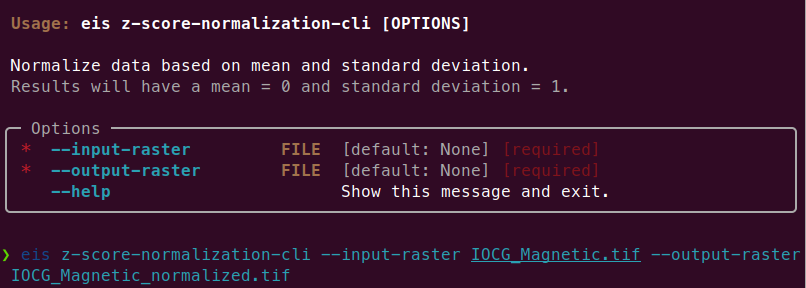
Since EIS Toolkit has a large number of dependencies, conflicts with the dependencies of other Python software are very likely to occur. This is why EIS Toolkit has an additional CLI API that is primarily intended for integrations with other software (such as QGIS). Using the CLI API, each tool can be accessed in a well-defined way by other programs that execute EIS Toolkit as an isolated Python process. The CLI API can be used directly in a traditional geoprocessing fashion too, but so far the focus has not been to make it a convenient interface for people.
EIS QGIS Plugin
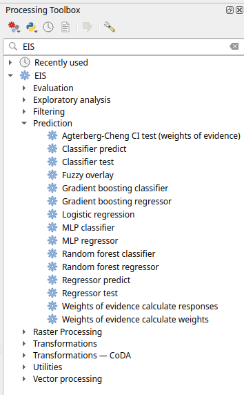
Next, let’s look at the EIS QGIS Plugin. It consists of two parts: EIS QGIS processing algorithms and EIS Wizard. The processing algorithms can be accessed from QGIS Processing Toolbox.
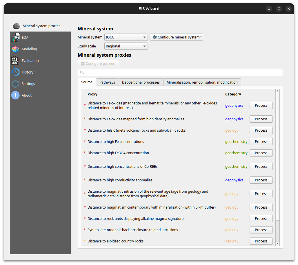
A more guided way to use the plugin is via EIS Wizard. It is a GUI ( graphical user interface) designed to perform MPM workflows in a structured way. EIS wizard consists of pages that are designed to be walked through from top to bottom in general, but in a non-restrictive way that allows switching pages whenever the user wishes so. The pages of EIS Wizard are Mineral system proxies, EDA, Modeling, Evaluation, History, Settings and About
On the Mineral system proxies page users can process their measurement data so that it can be fed into the prediction models. Users can use the provided default IOCG (iron oxide copper gold) mineral system proxies or create their own mineral systems with custom proxies. These custom mineral systems can be exported and imported as JSON files, making it possible to build a shared mineral system library in the future. Each proxy is associated with a workflow with one or more processing steps. The available processing steps are:
- Distance to features
- Distance to anomaly
- Interpolate
- Binarize
- Proximity to anomaly
- Proximity to features.
The output of a workflow is a proxy raster that contains some information that is believed to correlate with mineral deposit locations. The raw measurement data is processed to proxy form to filter out irrelevant pieces/noise, normalize data ranges and to facilitate a mineral system -driven approach for the modeling process among some other reasons.
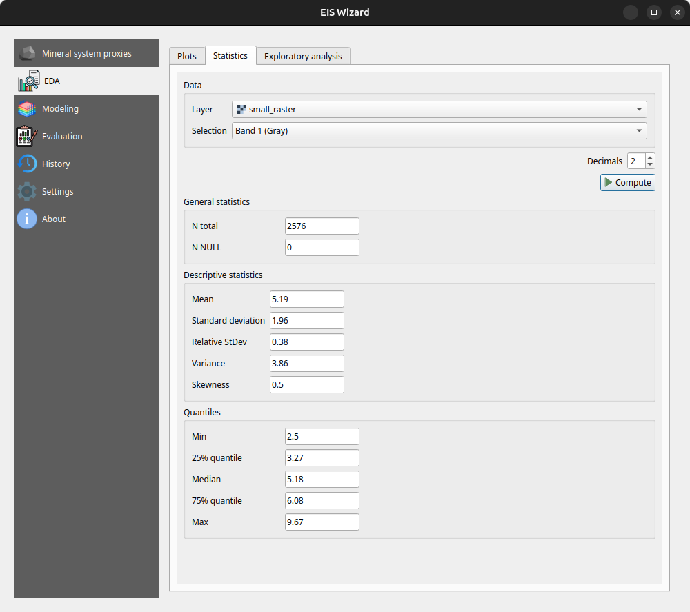
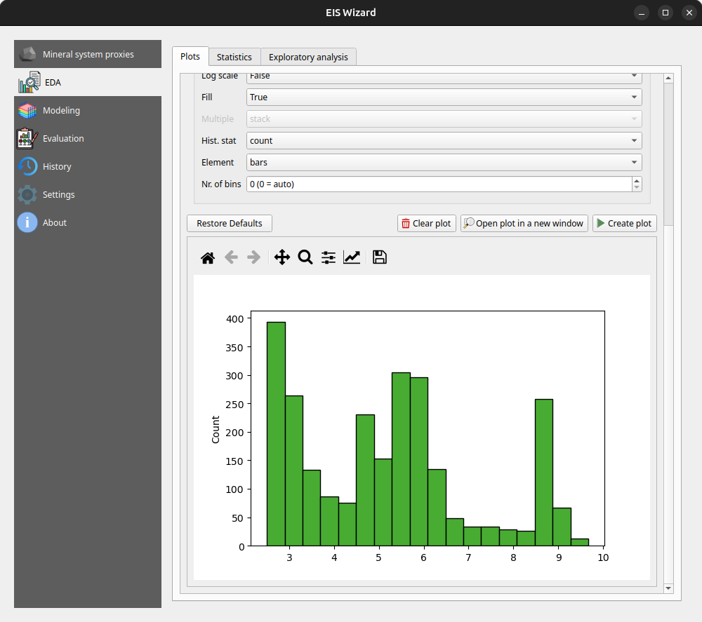
At any time, users can inspect their data in the EDA page: EIS Wizard enables creating plots for vector and raster data. Users can also compute different statistics from their data or use the exploratory analysis tools.
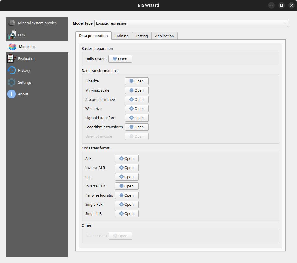
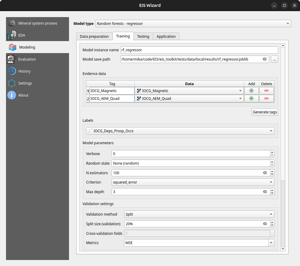
In the Modeling page, users can apply ML and data-driven models on their data. The page consists of a model selection dropdown menu and tabs for different steps in the modeling process. For supervised ML models the tabs are data preparation, training, testing and application. In the data preparation tab, users can prepare their data with several transformation tools before moving on to training the selected model with the data. After training and testing the model, it can be applied to classification/regression tasks on new, unseen data to make the actual predictions. Fuzzy overlay and weights of evidence don’t follow the same train-test-predict workflow and therefore have their own sets of tabs.
In the Evaluation page, users can evaluate their model by computing several metrics such as accuracy, precision, recall and F1 score. Users can also plot, for example, a confusion matrix or a ROC curve to evaluate the prediction results.
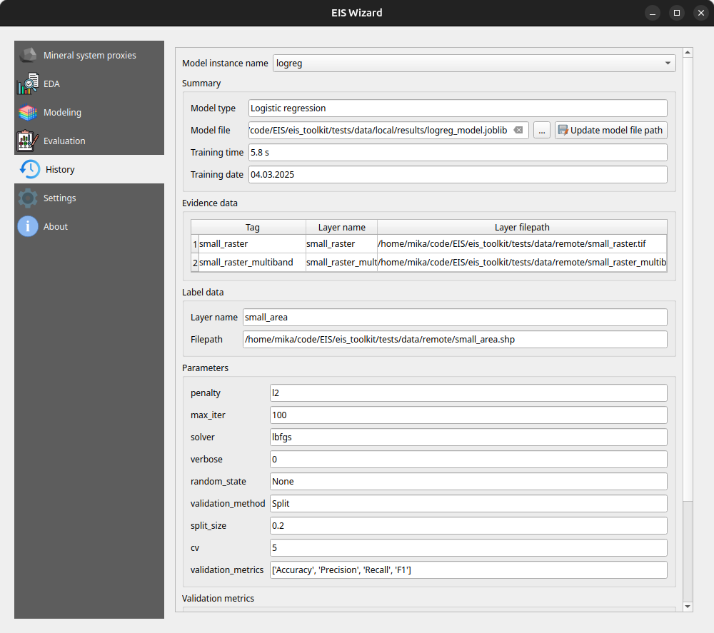
On the History page, users can view information about previously trained models whereas on the Settings page, EIS Toolkit configuration is set and various customizations to the user experience can be made. For a more thorough overview of EIS QGIS Plugin, please visit its wiki page.
Retrospective
The project has been largely successful in terms of the software work package. We implemented a wide range of tools, with EIS Toolkit reaching its full release in May 2024 and EIS QGIS Plugin last November. Since then, both software applications have received new features and undergone minor improvements.
However, not all planned features were implemented. The originally intended support for mineral systems beyond IOCG is missing, mainly due to dependencies on other work packages. To address this, we have provided users with the option to define custom mineral systems.
Overall, we are pleased with the project’s results and the potential impact of these tools. EIS Toolkit brings together relevant tools for MPM like no other free software before, while EIS QGIS Plugin offers a user-friendly interface for navigating each step of the MPM workflow in QGIS. As open source software, they are freely accessible without licensing costs. We look forward to seeing them adopted by geologists and mining professionals. If you feel that some tool that is important for your workflow is missing, or you need help with using either software, don’t hesitate to reach out.
This article was written by Mika Sorvoja.
Three LiDARs have been monitoring traffic around Esplanadi in Helsinki from November 2023 to August 2024. The data was collected by Flow Analytics and it can be downloaded here: https://flow-portal.com/ (requires registration). After the data collection, all that was missing was a tool to analyze all this data.
We had the pleasure to work a project with Forum Virium Helsinki, the aim was to develop a tool capable of analyzing the data collected by the LiDARs and to conduct a small analysis on this experimental data. The end users of this tool would be the traffic researchers of the city of Helsinki. As LiDARs allow collection of more data than more traditional traffic counting methods, their use can be expected to increase.
We decided to implement the tool as a QGIS plugin which was named FVH-3T (Forum Virium Helsinki – Traffic Trajectory Toolkit). The plugin consists of two buttons and three QGIS processing algorithms. Its use is very simple: first, the user imports a traffic point layer into QGIS and creates an empty gate and area layer using the buttons in the Plugins toolbar. Next, the user draws gates and areas in locations where they wish to study traffic.
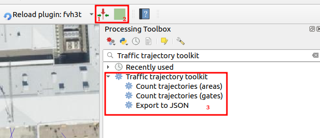
When the gates and areas are drawn, it is time to run a processing algorithm. There are three of them in the FVH-3T plugin: The first two are for the actual traffic census while the third one is for exporting the results computed by the gates into JSON-format. Before running either of the two “Count trajectories” processing algorithms, the user can set a desired timeframe for the calculations as well as the class of traveler. Running the processing algorithm creates trajectories from the point data and calculates some movement statistics both for them and the user-drawn gates/areas. Both processing algorithms can either be run as a single process, or split the studied timeframe into several smaller intervals ussing the QGIS batch processing interface.
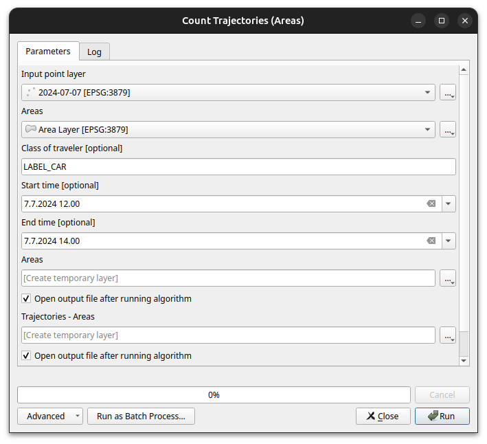
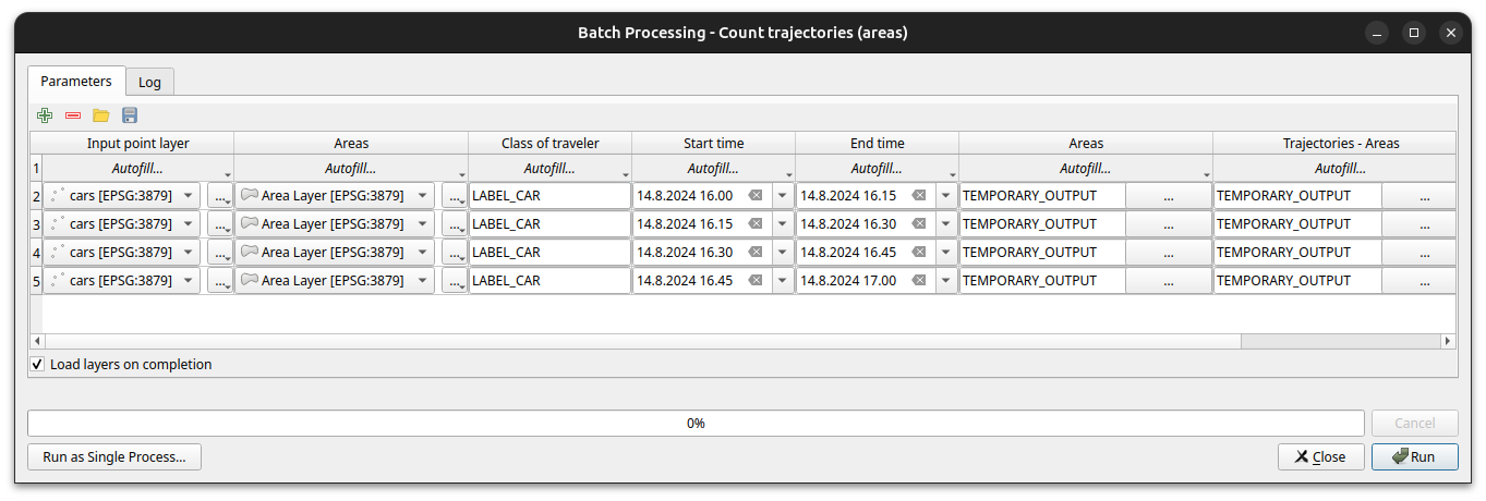
As stated above, running the processing algorithm draws trajectories from the point data. When running the “Count trajectories (areas)”, trajectories are generated only for points inside the user-drawn areas while when running the “Count trajectories (gates)”, trajectories are created for all points in the set timeframe.
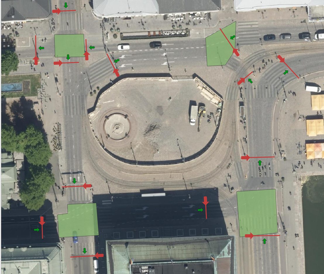
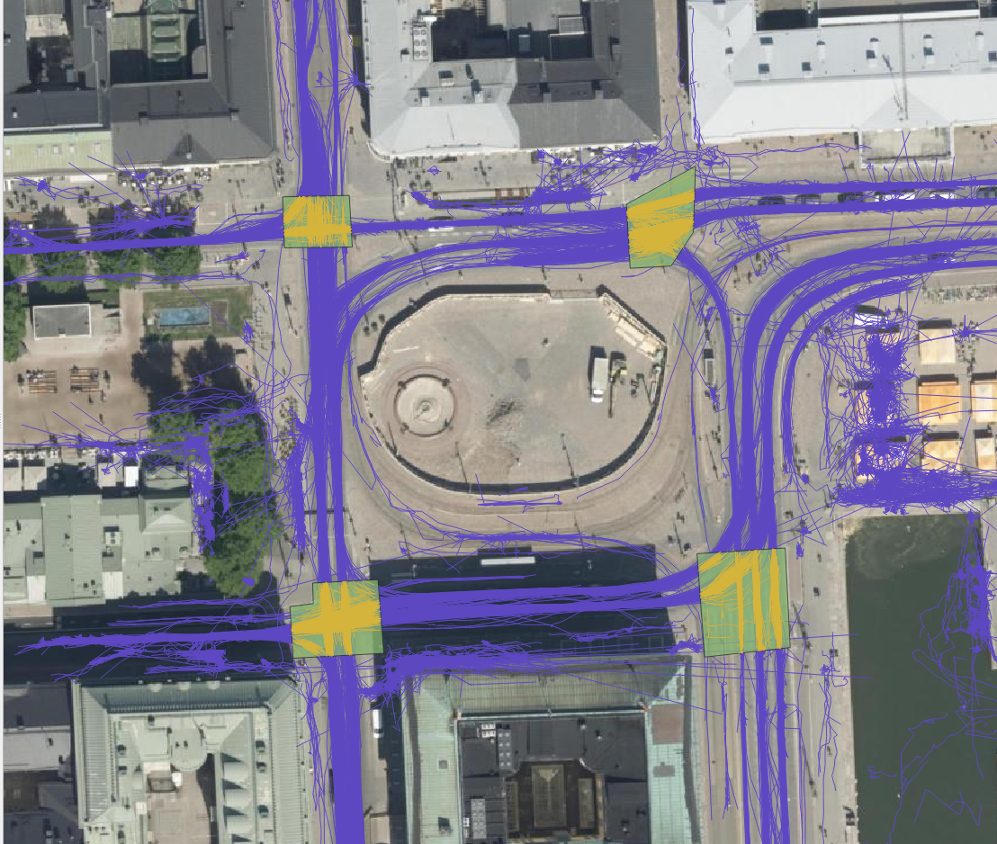
For each trajectory, length, duration, and average and maximum speeds are computed. For each area drawn by the user, the number of trajectories that it intersects are counted as well as their average speed. This allows, for example, to study congestion at intersections. For each gate, the number of intersecting trajectories per direction and the average instantaneous speed and acceleration of the intersecting trajectories are calculated. Gates are thus used to analyse traffic census. They can also be used to analyse pedestrian crossings.


The FVH-3T QGIS plugin can be used for analysing traffic flow on the general level as well as for more detailed study of individual travellers. Trajectories can be used, for example, to study how diligently pedestrians use crossings or whether many cross the driveways at the wrong place. Similarly, it can be studied whether cyclists use the cycle lanes intended for them, do they follow the intended direction of cycle lanes or do they find other paths. Gates can be used to study traffic volumes, speeds and accelerations at desired locations, and whether some cars or cyclists go in the wrong directions. With areas it is possible to analyse, for example, how badly intersections get congested.
In our small analysis, we discovered, for example, that car volumes were on average the highest on Fridays and lowest on Sundays during the observation period. In contrast, we did not observe any particular day of the week when average speeds at intersections were significantly higher or lower than average, but we did find some specific dates when the average speed in intersection(s) was lower than usual. These were usually days, when there were a lot of pedestrians in the area. For example, the 15th of August was one of these slower days, and on that date the Night of Arts brought several concerts to the area.
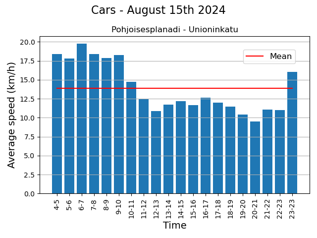
These eventful days also showed that the LiDARs were able to monitor individual pedestrians in the crowd. Regarding the pedestrian movements, we found, for example, that although the majority use crossings conscientiously, it is still quite common to cross the driveway at the wrong place. Similarly, although the cycle lanes in the Esplanadi area are in active use, some cyclists use the pedestrian lanes.
The project was interesting, not the least because we got develop a tool and the to try out the tool in practice, and also to learn the basics of traffic analysis. One of the greatest benefits of the tool is that the researcher can draw the areas and gates to those locations they are interested in and in the scale they are interested in.
This article was written by Mika Sorvoja.
In an era where data quality is paramount, the strategic management of geospatial data is a cornerstone in environmental data management. Accurate, coherent, and high-integrity data isn’t just a technical requirement—it’s the lifeblood of cities and other entities dedicated to protecting our natural world. To have ”Big data” means nothing, it’s all about having the right data.
In the pursuit of these objectives, minimizing manual labor in data entry and management is essential. It frees up valuable time for subject matter experts (environmentalists & co.), allowing them to focus on analysis and decision-making rather than data administration tasks. By streamlining the processes that handle complex environmental datasets, we can unlock new efficiencies and insights, driving forward the mission of nature conservation with precision and agility.
Now, let’s dive into the main value of this article. By implementing the OGC-based WFS-T protocol in your Enterprise GIS environment, you can facilitate secure GIS data editing by external stakeholders and others. The combination of PostgreSQL and GeoServer provides robust security management, while QGIS offers a user-friendly way to collect data for the end-users.
In this blog post, I’ll introduce an Enterprise GIS workflow we developed for the City of Tampere. I’ll focus on the practical steps and key technologies that facilitated smooth integration of the workflow. I’ll try to cover essential technological concepts to provide a clear and helpful guide, potentially aiding you to adopt a similar strategy in your own workflows.
Context: Geospatial Data Management for Nature Protection
When I first began working on this project with the City of Tampere, I was immediately drawn into a complex tapestry of environmental datasets, each characterized by a diverse array of field names and content. Understanding the nuances of these datasets presented its own set of challenges. Bit by bit I developed a deep appreciation for the critical role this data plays in the city’s environmental conservation efforts. It became clear that these aren’t just arbitrary sets of numbers and coordinates; they are the vital underpinnings supporting Tampere’s goals for nature protection.

So, basically our goal was to enable the city a process through which they could gather this data from the nature protection consultants in a secure manner.
In a process like this, it’s crucial to begin by asking ‘Why’ questions—many of them. By attentively listening to the city officials and understanding their business processes, we gained a comprehensive view of the various factors critical for managing this data.
This is where Gispo’s expertise and experience truly shine. Our customers often have headaches around different geospatial data management issues, and we try to help them as much as we can.
The Power Trio: PostgreSQL, GeoServer, QGIS
The City of Tampere extensively utilizes the Power Trio PostgreSQL/PostGIS, GeoServer, and QGIS, forming the core of their geospatial data management system. PostgreSQL, with its PostGIS extension (for spatial functionalities), provided the centralized database management system, ideal for storing and querying complex spatial data whereas GeoServer serves for serving this geospatial data securily over the web with the OGC-based standardized web feature services, enabling the city’s environmental consultants to access and interact with the data remotely. Its compatibility with various data formats and standards, coupled with its robust security features, ensures that data is not only accessible but also protected. Meanwhile, QGIS offers an intuitive interface for data creation, data validation and data visualization (as always!). By customizing and configuring these open source tools, we were able to develop a solution that aligned with Tampere’s operational requirements.

QGIS Forms: Streamlining Data Entry
The key to simplifying data entry in our geospatial workflow is the use of QGIS Forms. This feature in QGIS allows for user-friendly pop-up windows to edit attribute information for geospatial features, such as selecting a building type when creating building features on a map. With QGIS forms we could enable e.g. drop-down lists, and calendar views for the users.
These forms are automatically created based on the specific data types defined in the database-level. The customization of these QGIS Forms is further enhanced through the use of QGIS’s “Drag-and-Drop Designer”. This feature allows for a high degree of flexibility, enabling us to add tabs and other components to the pop-up window that opens up to the user when she/he is creating data.
Securing The Data with PostgreSQL and GeoServer
Given the sensitive nature of the data and the involvement of numerous external data creators, we had to design a workflow that ensures each consultant’s data remains confidential. This required implementing ‘Row Level Security’ in PostgreSQL, along with user management at both the database (PostgreSQL) and application server (GeoServer) levels. Row Level Security allows us to control write-and-read permissions at the row level, enabling us to maintain a single table for all data storage. This approach simplified data management compared to using multiple tables.

Final words and future Steps
We frequently collaborate with customers who need to securely and efficiently integrate geospatial data from various sources into their complex enterprise IT systems. Whether it’s environmental data, municipal infrastructure, or wind turbines, at Gispo, we’re fortunate to work across a diverse range of fields and sectors.
If you are lucky enough to embark on a similar journey, here’s what we suggest:
- Start by working backwards from your end-user—make sure you fully undestand their needs.
- Grasp the IT requirements and limitations so that you can design the right IT solution.
- Go for it! With each iteration, you’ll get closer to meeting all the user needs (at least the important ones).
The open source geospatial technologies have once again proven their value for the City of Tampere.
Thank you for your time. I hope we’ve offered some valuable insights for your upcoming Enterprise GIS projects. If you have any questions or need further guidance, don’t hesitate to reach out. We’re here to help you navigate the complexities and make your next project a success.
We are part of a major geospatial digitisation project in Europe called Location innovation Hub (LIH). It is one of four Finnish EDIH projects and aims to provide help in GIS-related issues for 200 organisations EU/EFTA wide. There are 8 partners diligently working on providing all sorts of geospatial services for free for their customers. Gispo had originally a goal of 28 clients to serve but we were a bit eager and set the bar slightly higher and now the goal is 43.
Every new LIH client gets a free consultation session and the amount will be decided separately. At Gispo the usual consultation has been from 2-3 hours to 2 days tops (so around 500€-2000€/client). The costs are paid by the EU and Business Finland and the partners, so for the client the consultation is totally free. Interested? You can find more details about how the LIH consultations work and the contact form for consultation here.
Why free?
The idea is to boost public sector, entrepreneurs and startups to gain new insight on geospatial information and tools. In my opinion we are entering the golden era of a full blown GIS usage: we have the data, we have the tools, we have the knowledge – now it is time to start using and creating new innovations and thus changing the world.
There is no catch – or of course there is – we are hoping these free consultations will start a longer client journey with us in the near future and hopefully spread the word on open source geospatial tools.
And this is what we are seeing:
Advising the client for just a couple of hours can be a huge marketing asset for the new businesses and can significantly affect the organisation’s way of doing things.They might not know about the possibilities of GIS, what data there is or how to use it.
The client’s personnel can be from totally different fields and GIS stuff is not usually very familiar to them. The clients’ backgrounds have been varying thus far from tourism to nature conservation or from renewable energy to application development. So just a little nudge from GIS specialists can have a tremendous impact.
We have been consulting now around 15 different LIH-clients and many more are lining up for the free (I would say outstanding) consultations. No client need has been the same so the consultations have also been very challenging for us – in a good way.
Some happy customers
Many of Gispo’s LIH-clients have wanted a small QGIS workshop just to get some ideas on what you can do with QGIS and GIS in general. The “LIH-card” can be used also in our regular open courses – it is up to the client to select what is the best way to use this benefit.
Location is everything
Here is a simple example of what location (and information about location) means to the world not used to GIS. We created a simple QGIS project with basic information like roads, aerial images, buildings, services from OpenStreetMap etc. and the client almost cried of delight when she saw her operation area for the first time on a map. For us this was a really simple task, but for her it provided a possibility to view information geographically and finally create decisions based on maps.
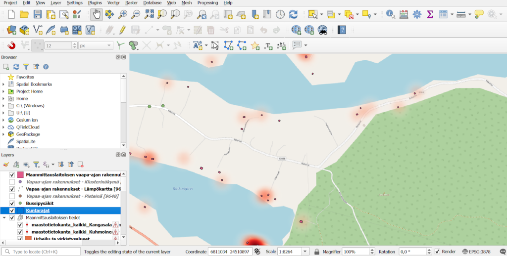
QGIS project with essential geospatial information collected together for the LIH-customer.
Another location-is-everything-type of consulting was done for a real estate company that was interested in comparing several locations based on their accessibility to public transport. Through a consultation with LIH, we were able to determine the travel distances and times from various points in Espoo using public transport. The attached maps illustrate the accessibility of the Ainoa Commercial Center in Tapiola. As you can see, the recent extension of the subway (Metro) towards Espoo has significantly improved the region’s accessibility.
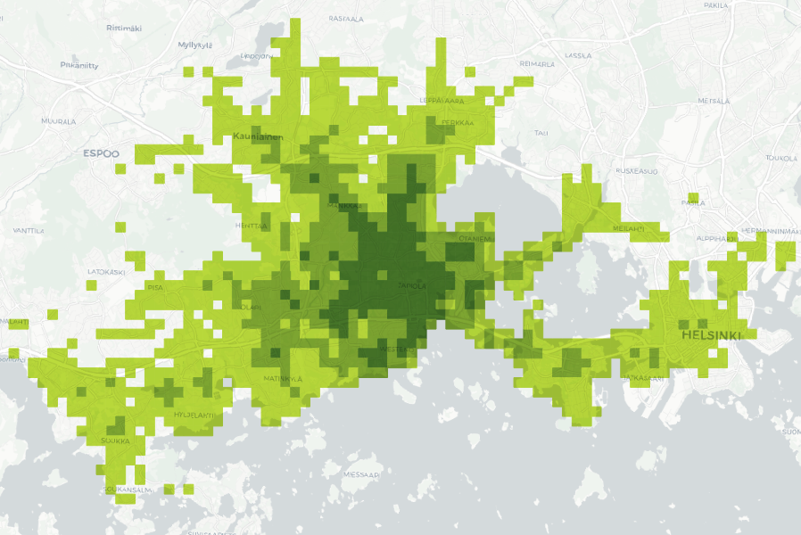
Public transport accessibility to Ainoa (Tapiola, Espoo) by travel time zones (under 20, 20–25, 25–35 min). Data: University of Helsinki (2023).
Consulting startups to grow their business
Geospatial data is nowadays an integral part of many services and it is utilised often in very innovative ways by startup companies. The startups might have a solution already available and they have been solving many GIS-related problems along the way. But as being “outsiders” to the geospatial industry these companies are usually very interested to hear about the different standard tools and methods available to enhance their solutions. LIH-consultation might help them understand how things could be made more efficient and how to scale up and future-proof their technological and architectural decisions.
UpCharge is a cool power bank sharing tech company and they wanted to learn more about utilising and incorporating spatial data into planning where power banks are needed. Being able to visualise the collected data about when, where and how long a power bank has been used is extremely useful when planning new locations for the stations. With Kepler.gl we were able to create an insightful interactive map with multiple useful layers such as heat maps describing where pickups and drop offs were most frequent and animations of the movement of the power banks based on the start and end location. Pauli Mankinen, one of the co-founders was happy about the results: “We have gained valuable insights into the use of geospatial data in our customer segment, which has helped our sales efforts”.
Workshops to gain more insight on open source GIS
Some of the LIH-customers have requested training instead of data-analysis or consultation. We usually have longer training sessions available for QGIS, PostGIS or GeoServer to gain more understanding about a certain tool, but these smaller workshops are also useful if you want to learn new things fast and gain a glimpse on what you can do with a certain tool.
Some of the employees of the City of Turku have been using commercial MapInfo software software and are now looking to replace it with QGIS. They were interested in learning what possibilities open source tool QGIS (that we at Gispo love) has to offer. As a LIH consultation we organised a 3 hour workshop where we introduced QGIS with its basic functionalities to the participants, who had varying experience in GIS and QGIS. They described what they needed to do with GIS software and our trainer showed them different tools and workflows. In the end of the workshop they discovered that everything that they had been doing with MapInfo could be done in QGIS. Of course the logic of certain operations might vary from one tool to another, for example how to create thematic maps or join two databases.
Elisa Mikkilä, the GIS coordinator at the City of Turku: “The workshop was very helpful in introducing QGIS to our MapInfo users, and everybody participated in the exercises enthusiastically.”
A one person nature surveying company reached out to us and we organised a 6 hour online workshop as a LIH consultation. The workshop was split into QGIS and QField sessions, both of which were 3 hours long. The content was highly customised based on the client’s materials and the processes. The main focus was on what kind of data the nature surveyors typically work with and how to efficiently utilise both QField and QGIS in the workflow. These kinds of workshops are very rewarding for both the client and us, because we are all the time working with real-world problems and learning from each other.
The Finnish Association for Nature Conservation (FANC) was interested in how they can benefit from spatial data, solve problems with it and utilise different GIS softwares like QGIS. With this goal in mind, two webinars were hosted with three speakers in total, one of which was from Gispo. The first webinar focused on the basics of spatial data while the second webinar included information about the data available via NLS and the basics of QGIS, which was our part. We went through the benefits of using QGIS instead of a web browser based map service and shared some useful links and instructions for starting to work with QGIS. Nature conservation has a high potential for benefiting the understanding and use of spatial data, and we were very pleased to have been part of this process.
Every now and then, we get to collaborate with IIEP, UNESCO’s International Institute for Educational Planning. This time we were introduced to the effects of rainfall on learning outcomes and school attendance in Sub-Saharan Africa.
Overview of the project
The heavy rains affect school goers in many ways. One might not be able to get to the school, or the school building might suffer from flooding, or the rain might cause so much noise it is impossible to teach and learn inside. The background research is available here.
The school calendars are largely shared within and across countries, and might have very little variations since colonial times. So no wonder the school calendars don’t take local conditions into account. However, considering local conditions like the weather or agricultural cycle in planning the school calendars could help increase the attendance rate during the school year and thus result in better learning outcomes.
Our friends at IIEP-UNESCO are running a project that aims to provide policy advice to governments in educational planning and to support the implementation of locally adjusted school calendars. We were happy to join in as we were tasked to find ways to analyze precipitation data in order to find time periods uninterrupted by heavy rain, and thus more suitable for the school calendar.
The school calendar plugin
We created algorithms in the QGIS Processing framework for processing the precipitation data and visualizing the results. As an end result a total of four processing algorithms were packaged together to create a QGIS plugin to accomplish the following:
- to download precipitation data from Google Earth Engine
- to calculate the daily means for precipitation
- to find time periods uninterrupted by heavy rainfalls
- to visualize the precipitation data and time periods as a calendar heatmap

Precipitation data download
The obvious first step is downloading the data. The plugin uses precipitation data gathered by the Global Precipitation Measurement (GPM) international satellite mission and distributed by Google Earth Engine (GEE). The download needs to be done only once, as long as the data is downloaded from a larger area you are interested in (the whole of Africa in our case). Then the analysis can be run as many times as needed for subsections of the larger area and with different parameters. The data is reduced from half-hourly or hourly data to a daily sum in GEE and one raster is downloaded for each day in the given time period.
Daily mean analysis
After the data is downloaded the next step is to select what area you want to use. The algorithm allows you to use any polygon layer to select the area you want to analyze, and thus makes it possible to analyze e.g. any administrative borders. The algorithm calculates the daily mean of precipitation in the given area. If the data is from several years, one might be interested in looking into each year separately or looking into an average year in order to avoid making long term decisions based on fluctuations of a single year. As a result this second algorithm creates two output layers – one for daily means and one for average year daily means.
Uninterrupted period analysis
Now that the data is downloaded and prepared it is time for the actual task in hand: to look for the optimal uninterrupted time frame for the school calendar. As an input layer for this third algorithm either output layer from the previous algorithm can be used. There are several parameters to set as per your preferences (what the threshold is for too much rain and whether you want to allow a certain number of days to exceed this threshold without breaking the time period). As an output, a new layer is created where the start and end date of each uninterrupted period are saved as attributes.

Create calendar heatmap
Finally, we can visualize the results. The fourth algorithm takes in output layers from the previous two algorithms (you can also visualize just the mean precipitation without the uninterrupted period) and creates a calendar heatmap. The calendar view shows clearly the patterns of rainy days in the chosen area, and visualizes the uninterrupted period suitable for a school year on top of that.

Flexible and efficient tool!
The tool is rather flexible as it is possible to choose whatever area you want or need for the analysis, and set parameters to your liking as well. It is also efficient in handling data. It also supports running a batch process allowing for efficient inspection of several areas or parameters at the same time.
We hope this tool will help create school calendars that are more accommodating to local climatic factors.
Do you want to hear more about this project? We will be presenting at FOSS4G Europe in Tartu in July!
The EIS project we wrote about in a previous blog post has been running for over a year and it’s time to look back at what we have accomplished in the first third of the project. If you are new to the project I recommend reading the previous article before continuing on reading this.
The role of Gispo in this project is to facilitate the software development of EIS Toolbox and EIS QGIS Plugin (previously called EIS QGIS Wizard) and to take part in the development work. The main focus during the first year of the project has been analysing the workflow related to mineral exploration and designing the EIS Toolbox -Python library and the EIS QGIS Plugin. We have conducted end-user interviews documenting the different tasks and steps of their workflow to design a user interface that is both intuitive and easy to use. We have seen demos and studied software currently used for mineral exploration and tried to incorporate the best parts of them into the design of EIS QGIS Plugin. Furthermore, we have arranged workshops together with project partners detailing the workflow to be used in the QGIS EIS Plugin.
We have put a lot of emphasis on designing a good user experience that would be as intuitive as possible and guide the end user in different steps of the workflow. In most cases the workflow is not linear but more of an iterative one. EIS QGIS plugin offers a graphic interface for EIS toolbox and supports the user during the different stages of the work. EIS toolbox can also be used as an independent library or as a part of another application.
The user will likely do some pre-processing for their data and a series of Exploratory Data Analysis methods might be used to refine the used input data and parameters to be used in further steps. In this kind of non-linear workflow it’s important to have clear indication which steps have been completed successfully, which might be run again and which steps are still to be done.
Beta release coming up
The next milestone for the EIS project will be the beta release of EIS Toolbox. It is planned for release in November and will contain the most vital parts of the library. The goal is to enable going through each step of the workflow although not all analysis and processing functionality will be feature complete in the first release. After the beta release the development continues with finalizing the functionality and testing with a wider audience. The final release is due in 2024.
Visualising traffic is a tricky yet important task in city planning. City of Helsinki was interested in where traffic occurs and in what magnitudes. As there can be vast amounts of traffic data available for a city and the data is geolocated, map visualisations give an intuitive and powerful way to look at the data. Intersections are particularly interesting places to examine since that’s where the most traffic usually occurs. We had a vision of what we wanted: Have traffic flows represented as directional arrows with meaningful colour- and width-coding. In this post, I will introduce a POC-spirited intersection traffic visualisation QGIS plugin we created for the city of Helsinki for this task.
Turning traffic would be represented with a curved arrow that would trail close to the intersection centre. We considered utilising road geometry data to create visualisations trailing accurately the roads, but ended up deciding that it was unnecessary and would potentially have even less illustrative power than freely created curved arrows. With the goal in mind, we dove into inspecting the data we had in our hands.
Combining the data
As a starting point we had two datasets: One vector point file showing roughly the intersection branch locations and another vector point file with the traffic data (where the points were located approximately at the intersection centre). We had traffic data for multiple days and individual hours in addition to sums for a given day, but decided that we would not focus our efforts on creating any interface for time selection and that the plugin would simply aggregate all data for each location. It would be up to the user to filter their data before running the plugin.
What we wanted was a dataset where one line or curve feature would have the traffic data from branch A to branch B. Fortunately, the datasets had two fields serving as links for combining: intersection ID and intersection branch ID. With intersection ID we could find the correct set of branch geometries for each traffic data point, and with intersection branch ID we could then find the specific branch point locations for each individual traffic data point.
Here are the processing steps for those interested in details:
- Find all unique intersections from traffic data
- For each intersection one at a time…
- Select features from both datasets that belong to the intersection
- Calculate an approximate intersection centre point from the branch location points
- For each traffic data feature in the current intersection one at a time…
- Find branch location points that correspond to the centre and end points for the traffic data feature
- Calculate the middle point between the start and end points of the previous step
After this, we had one dataset with line features consisting of three points, with traffic data attached. This was what we had wanted but not yet very illustrative.
Adjusting the geometries
Even with styling, our new geometry layer wasn’t very good yet – the traffic lines from A to B and from B to A were on top of each other and the lines for turns did not have any illustrative curvature. The next step was to make adjustments for the produced geometries. With trial and error, we ended up with some constant values by which we moved the lines either away or towards the intersection centre to avoid overlap and represent right-hand traffic.
Another geometry adjustment was to move the middle point of the line representing turning traffic towards the intersection centre. As we were anyway not aiming to accurately follow the road geometries, we decided that moving the centre point of the line half way towards the centre of the intersection already added a fair amount of illustrative power to the visualisation.
Lastly, we discarded the idea of using straight lines and chose to use CompoundCurve line type in QGIS. We simply used the start, middle and end points we calculated earlier and created the curved geometry from them.
From geometries to visualisation
Now that we had the geometries with traffic data as an attribute, the last task was to come up with illustrative styles. We had already thought in the beginning of the project that line width and colour are the two most intuitive styling options we want to utilise. Ultimately, it was quite simple to apply the styling since we had only one important variable to show: the amount of traffic. However, in testing we noticed that putting a colour or width scale for the whole dataset was not always very helpful when inspecting some smaller areas, and therefore we created two extra styles where the scaling was created separately for each intersection. The four different QGIS visualisation styles we created are:
- Colours-global: This style colour-codes the traffic lines globally; the minimum and maximum are taken from the whole dataset. Red represents a high amount of traffic and blue less traffic. The widths of the traffic lines do not change. This style works well if one wants to compare several intersections with each other and not obstruct any background details by widening the lines.
- Colours-local: Here the traffic lines are colour-coded for each intersection separately. This means that different intersections are not directly comparable with each other, as the same colour can signify different traffic amounts. However, in this style it is easier to distinguish variability within each one intersection, and so it fits when intersections are inspected one at a time. Red represents a high amount of traffic and blue less traffic. Here the line widths remain constant as in the other colour-coded style.
- Sizes-global: In this style, the line widths show the amount of traffic. The size scaling is linear with minimum and maximum from the whole dataset (although 0 traffic is still represented with a very narrow line!). Line colour represents the entry direction to the intersection. Sizes are a very intuitive and powerful visual element for the human eye and consequently for many the size scaling style is their preferred style to easily compare traffic flows.
- Sizes-local: As you might have guessed already, the only difference with this style and the previous one is that now the line widths are scaled within each intersection, not with the whole dataset. This style can be better for inspecting intersections one at a time since the visual differences are clearer within an intersection.
Afterthoughts
At the end of the project we were quite happy with the results. We had different visualization styles for different needs, and we had reached our goal without having to resort to any road geometry dataset. As the project’s aim was to demonstrate and test ways to visualize traffic data, the created workflow and QGIS plugin are applicable for the specific datasets we used.
Leveraging open source software to unlock the power of geographic information
The European Commission has been a strong advocate for the use of open source software, recognizing its potential to reduce costs, increase flexibility, and promote innovation. One area in which the Commission has identified a great potential is the use of geographic information for data analysis and policy-making.
Geographic information can provide valuable insights into a range of complex issues, such as demographic trends, economic conditions, and environmental patterns. The Commission recognizes the importance of leveraging this information to support evidence-based decision-making, and has taken steps to build capabilities in this area. One way the Commission is doing this is through the use of open source software, such as QGIS, which enables employees to easily access and analyze geographic information. By training employees in the use of QGIS, the Commission is empowering them with the tools they need to harness the full potential of geographic information for policy-making. Gispo delivered two QGIS training courses for European Commission and Parliament employees in November 2022 (in Luxembourg and Brussels).
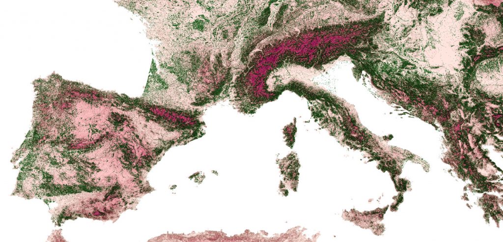
From map-making to guiding decision-making with geographic information
Geographic information has enormous potential to revolutionize the way we approach decision-making. Idenfying this potential for every attendee of a QGIS course and implementing the first steps for the value realization with QGIS is the hard part of these types of training courses. Besides the growth of geospatial data is leading to an exponential increase in the possibilities for analysis and interpretation which makes the experience kind of overwhelming (!).
Open source geospatial technologies offer a flexible solution to this challenge. By utilizing tools such as QGIS, organizations like the European Commission can provide end-users with the necessary data, tools, and insights to effectively analyze domain-specific geographic data. This approach eliminates the overwhelming nature of big data (having data all over the place) and enables users to focus on gaining valuable insights and making informed decisions.
The combination of growing data sets and flexible open source technologies will continue to push the boundaries of what is possible. By embracing these new tools and techniques, organizations can harness the full potential of geographic information to drive more informed and effective decision-making.
Real-World Experience: Insights from the Field
During the QGIS training courses the attendees gained valuable insights into the potential of QGIS and how they can leverage it to support their domain-specific processes.
The courses were prepared precisely for this audience and the attendees valued the tailoring of the training material:
“I liked the structure of the course and that content was tailor made to EU institutions.”
As the trainees learned more they got more inspired by QGIS. The feedback showed that empowerment to use QGIS was appreciated:
“Freedom to play with the software and ask questions”
The trainees also appreciated the fact the individual needs were attended. The attendees were experts representing variety of domains, and it was important to identify what benefits GIS could provide for different domains. When asked what was executed especially well in the training, one of the trainees responded: “meeting the individual needs of each attendant”.
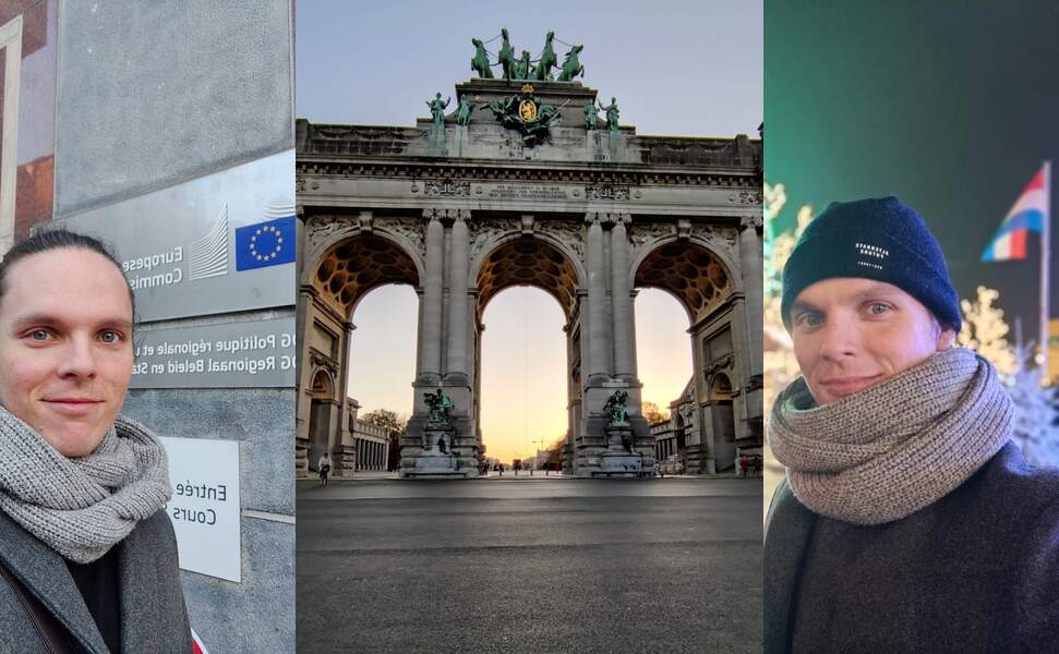
A final note: The importance of geography and the benefits of open source geospatial technologies
Geography has always played a major role in shaping the world around us, and in today’s data-driven society, it is more important than ever. The European Union, in particular, recognizes the value of geographic information in decision-making processes, which is why it has been working with open source software to unlock the full potential of this information.
The use of open source geospatial technologies has many benefits, including reduced costs, increased flexibility, and promotion of innovation. These benefits are especially important for organizations, such as the European Commission, that rely on geographic information to make informed decisions. By embracing open source software, the Commission is able to access the latest tools and technologies without being tied down to other solutions.
In conclusion, the combination of the power of geography and the benefits of open source geospatial technologies makes for a winning combination in today’s data-driven world. By leveraging these technologies, the European Commission is able to make informed decisions that shape the future of the European Union and beyond.
You can read more about tailored training and courses offered by Gispo in here, or contact Santtu to learn more.
Since it’s only in Finnish at the moment, probably some of you haven’t noticed, but there is a pretty little new web map service in town – at least if your town happens to be Tampere. Gispo recently implemented a simple open-source outdoor map service called outdoorstampereregion.fi with focus on mobility and lightning-fast browsing. The service should guide anybody in the Tampere region to any outdoor activities they could ever dream of, and it works beautifully on desktop as well, though most users enjoy it on the go.
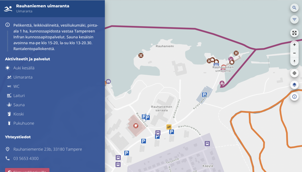
Table of Contents
Data-dependent styling: MapLibre expressions!
Zoom-dependent styling: More expressions!
Dynamic layers: URL parameters!
Introduction
To make the service as fast and simple as possible, I could list a variety of buzzwords, but basically they boil down to two: serverless and vector tiles. So the idea is that we have all the data in a PostGIS database and serve all of it in vector tile format with a barebones tile server called pg_tileserv. Technically, serverless here means we have no custom server code, just a database and a standard container running on your favorite container platform. The whole architecture might warrant a separate blog post later on, but here we want to focus on what the user sees on their screen. I will touch on the amazing features of pg_tileserv here too at the end of the post, though.
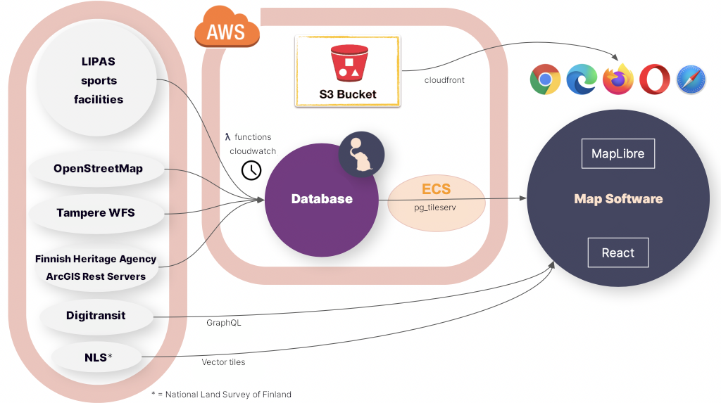
MapLibre GL JS is the open source fork of a map technology formerly known as Mapbox GL JS v1. Due to the projects having a common history, the vector tile standard that MapLibre supports is called Mapbox Vector Tile specification.
There are at least three (perhaps four!) reasons to pick vector tiles when going forward with a modern map service:
- Performance. Since vector tiles are vector data, not pixels, you can imagine the amount of data needed to transfer all the map layers in e.g. our map above. The amount varies greatly depending on if you transfer the map images, or just the encoded vector features in the area. — Obviously, the more features there are in an area, the more data you have to transfer, but in most maps the total amount of data is much smaller if you just transfer the layer data, not the image.
- They are data. Transferring raster map tiles, that is what the user gets. A raster image, no metadata, no vector features, no properties, nothing. If you want the user to get some extra data on a feature on a raster map, you have to implement a separate API calls anyway just to query and transfer the actual feature data. Transferring vector map tiles, on the other hand, each feature can have any number of properties and additional data bundled in. — This means we can be truly serverless, i.e. we don’t have to implement a backend that serves all the structured data. Of course, here you have to be careful not to encode too much data in the properties of each feature. That may slow down rendering of the map so that *gasp* it might sometimes be almost as slow as a raster map.
- They are rendered in the browser. Partly, again, this is a performance issue, since this allows for fast rendering of things such as 3D views. Indeed, MapLibre supports 3D rendering of maps in the browser by default, and 2D rendering and zooming is blazing fast. — But this is more than just a performance issue. This also gives the tile client much more control over what the user sees. Don’t like the color of the map or the shape of the markers? Want to tweak the background when the user does something? Want to highlight some features and fade out others in response to user actions? Want to make a completely different view of the data? You are in control of what your map looks like, not just rendering tiles made by somebody else.
- Fancy extra stuff. You have to count on us on this one, or read the last chapter of this blog post, to find out all the extra things pg_tileserv can do for you out of the box.
So browser rendering is what we are talking about here. Mind you, not *all* the data has to be vector. Indeed, the Tampere outdoor map allows e.g. looking at the vector features on top of the raster aerial images of the area. MapLibre allows you to mix and match raster and vector layers to your liking.
MapLibre styles in React
So, it is MapLibre GL JS that is responsible for reading the tiled vector data and drawing the map. How the data translates to the map seen by the user is defined by the MapLibre styling specification. Among other visual things, it defines what are the data sources for the map, what are the map layers to draw and, for each layer, how features are drawn. The style spec can, of course, be provided by the tile server, or it can be bundled in the UI or, indeed, it can be dynamic so that the styles may change. The great thing here is expressions, i.e. any layout property, paint property or map filter can be an expression that depends on the data or the state of the map.
Adding dynamic map styling to a React application is made possible by react-map-gl, which is a React wrapper for Mapbox and MapLibre GL JS. What this looks like in practice is a React component that just needs some props and child components:
<MapGL
  ref={mapReference as Ref<MapRef>}
  initialViewState={{
        latitude: 61.498,
        longitude: 23.7747,
        zoom: zoom,
        bearing: 0,
        pitch: 0,
  }}
  style={{ width: "100vw", height: "100vh" }}
  mapLib={maplibregl}
  mapStyle={mapStyle}
  onResize={toggleNav}
  styleDiffing={false}
>
  {/* Area polygons */}
  <Source id={LayerId.OsmArea} {...OSM_AREA_SOURCE}>
    <Layer {...{ ...OSM_AREA_STYLE, filter: categoryFilter }} />
  </Source>

  {/* Linestrings */}
  <Source id={LayerId.LipasLine} {...LIPAS_LINE_SOURCE}>
    <Layer {...{ ...LIPAS_LINE_STYLE,
        filter: categoryFilter,
        layout: {
          visibility: searchString === "" ? "visible" : "none",
        }, }} />
  </Source>

  {/* Points */}
  <Source id={LayerId.Point} {...POINT_SOURCE}>
    <Layer
      {...{
        ...POINT_STYLE_CIRCLE,
        filter: categoryFilter,
        layout: {
          visibility: searchString === "" ? "visible" : "none",
        },
      }}
    <Layer
      {...{
        ...POINT_STYLE_SYMBOL,
        filter: categoryFilter,
        layout: {
          ...(POINT_STYLE_SYMBOL as SymbolLayer).layout,
          visibility: searchString === "" ? "visible" : "none",
        },
      }}
    />
  />
</MapGL>
This is a simplified example of our actual outdoor map component. The example above renders a MapLibre map with four layers, three of which have a different vector tile source:
- Polygon layer from a vector tile source that provides some polygons from OpenStreetMap
- LineString layer from a vector tile source that provides some outdoor exercise tracks (line strings)
- Circle layer from a vector tile source that provides some outdoor exercise points
- Symbol layer from the same vector tile source that provides some outdoor exercise points
Instead of a single big style json file, this allows us to provide any data to any MapLibre layer as React props. Since we have a huge amount of data, we define all the layer styles in a separate style.ts file:
- known id strings for each layer so we can refer to the right layer
- source objects for each layer that tell MapLibre what is the address of the vector tiles, e.g.
export const OSM_AREA_SOURCE: VectorSource = {
  type: "vector",
  tiles: [
    `${process.env.TILESERVER_URL}/kooste.osm_alueet/{z}/{x}/{y}.pbf?filter=deleted=false`,
  ],
  minzoom: 0,
  maxzoom: 22,
};- style objects for each layer that tell Maplibre how to render the layer, e.g.
export const OSM_AREA_STYLE: LayerProps = {
  "id": LayerId.OsmArea,
  "source": LayerId.OsmArea,
  "source-layer": "kooste.osm_alueet",
  "type": "fill",
  "paint": FILL_PAINT,
  "minzoom": 13,
};
These style objects can be as simple or as complex as we desire. In general, we define the static style objects in style.ts.
“Static” here means that the styles may depend on the data in all kinds of exotic ways, but they do not depend on React state. In addition, as seen above, it is possible to introduce dependencies to the React state simply in the Layer props passed on to the layer. In our case, we have an object called categoryFilter that changes when the user clicks around in the interface, and triggers various data on each layer to be visible or invisible.
Another React prop that affects the visibility of layers is searchString. You can see that point and line layers will get visibility value true if searchString is empty. However, once the user starts typing in a search field, we don’t want to display all the features on the map; all the default layers are rendered invisible if the user has entered search mode.
Data-dependent styling: MapLibre expressions!
First, let’s focus on the style.ts that does not depend on React state. Our example above is already a good starting point. OSM_AREA_STYLE says that our OSM polygons should be painted with FILL_PAINT. What is that? Well, just another kind of object:
/**
 * Paint object for all area layers
 */
const FILL_PAINT: FillPaint = {
  "fill-color": COLOR_MATCH,
  "fill-opacity": 0.2,
};
Nice! So, it tells me to draw the OSM polygons with opacity 0.2 and the color COLOR_MATCH. Pray tell, what color is that? Well, it’s not actually a single color:
const COLOR_MATCH: Expression = [
  "match",
  ["string", ["get", "tarmo_category"]],
  "Luistelu",
  getCategoryColor("Luistelu"),
  "Uinti",
  getCategoryColor("Uinti"),
  "Kahvilat ja kioskit",
  getCategoryColor("Kahvilat ja kioskit"),
  palette.primary.dark,
]
This is a shortened version of all the possible object categories in our outdoor map. This is a MapLibre expression that depends on the tarmo_category property of the vector object. We will get different colors for the color fill depending on what kind of a polygon we are drawing.
In addition to color, obviously any layout or drawing property may depend on the data in a variety of ways. In our outdoor map, each point has a colored circle and a symbol. The circle color is selected like above. In addition to circles, we had the second point layer, which displays symbols for the same data:
export const POINT_STYLE_SYMBOL: LayerProps = {
  "id": LayerId.Point,
  "source": LayerId.Point,
  "source-layer": "kooste.all_points",
  "type": "symbol",
  "layout": SYMBOL_LAYOUT,
  "minzoom": 14,
};
Again, SYMBOL_LAYOUT is something that can depend on the data:
/**
 * Layout object for all symbol layers
 */
const SYMBOL_LAYOUT: SymbolLayout = {
  "icon-image": [
    "match",
    ["string", ["get", "tarmo_category"]],
    "Luistelu",
    "skating",
    "Uinti",
    "swimming",
    "Kahvilat ja kioskit",
    "cafe",
    /* In some categories (looking at you, parking) icons are determined by osm tags */
    /* We could also select icon based on type_name, but this will do for now */
    ["get", "amenity"],
  ],
  "icon-size": [
    "match",
    ["string", ["get", "tarmo_category"]],
    "Pysäköinti",
    1,
    0.75
  ],
  "icon-allow-overlap": true,
};
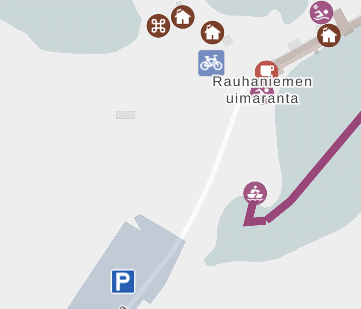
This has some weird things because we actually want to display icons based on tarmo_category or in some cases, original OpenStreetMap amenity tag, so we can have different parking and bicycle parking icons, even though they both belong to the Pysäköinti (Parking) category. Also, we want to render parking icons larger than other service icons, since they look different anyway.
Zoom-dependent styling: More expressions!
Finally, it is possible for the icons and layers to depend on zoom. You probably didn’t notice that in POINT_STYLE_SYMBOL, minZoom is set to 14. This means that below zoom level 14, this layer is not rendered.
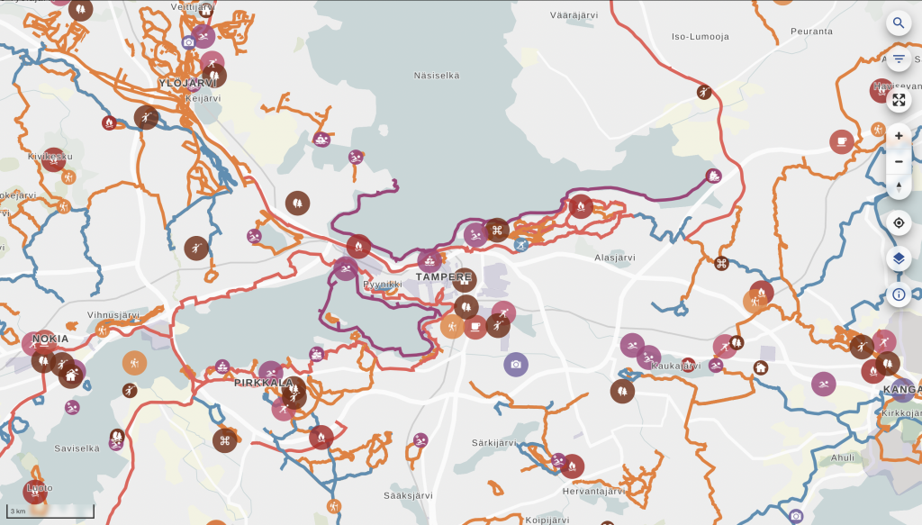
The trick here is that in actual code, we have lots of different layers depending on zoom level. This may not be the most elegant solution, but it is one we came up with to allow clustering points when the user is further away. Clustering (combining) feature data that has been already loaded to Maplibre layers proved tricky, so what we did is actually create lots of PostGIS views of all point layers in the database. Called point_clusters_8 all the way to point_clusters_13, we have a different vector layer for each zoom level, and all points within a given distance of each other are clustered on each level to provide a view like this when the map is zoomed out. When the user zooms in, the visible layer will change, and they will see more clusters or points in place of these clusters:
export const POINT_CLUSTER_9_STYLE_CIRCLE: LayerProps = {
  "id": `${LayerId.PointCluster9}-circle`,
  "source": LayerId.PointCluster9,
  "source-layer": "kooste.point_clusters_9",
  "type": "circle",
  "paint": CLUSTER_CIRCLE_PAINT,
  "minzoom": 9,
  "maxzoom": 10,
};
The code snippet above is a Maplibre style that will render the kooste.point_clusters_9 layer only in the right zoom range. All these layers contain both single points and clusters at each zoom. The way to render them differently is
/**
 * Point cluster layers at zoom levels below 14
 */
const CLUSTER_CIRCLE_PAINT: CirclePaint = {
  // indicate more spread out clusters by increasing the size when zooming in
  ...CIRCLE_PAINT,
  "circle-radius": [
    "interpolate",
    ["linear"],
    ["zoom"],
    8,
    ["match", ["number", ["get", "size"]], 1, circleRadius, 1.2 * circleRadius],
    13,
    ["match", ["number", ["get", "size"]], 1, circleRadius, 2 * circleRadius],
  ],
  "circle-opacity": [
    "interpolate",
    ["linear"],
    ["zoom"],
    8,
    ["match", ["number", ["get", "size"]], 1, 0.9, 0.9],
    13,
    ["match", ["number", ["get", "size"]], 1, 0.9, 0.7],
  ],
};
This snippet renders either a standard sized circle for single clusters or a larger circle if the cluster should have multiple points.
The radius of the circle could be made to depend on the size of the cluster, but it might not be very clear or informative; rather, the radius is made to depend on the zoom level. This illustrates the fact that the clustering radius (and the number of clusters) is dependent on the zoom level. interpolate is a MapLibre expression that scales the size linearly depending on zoom level, from level 8 to 13. circleRadius is a constant that can be easily tweaked to adjust the size of all symbols. We handle opacity similarly: even as clusters get smaller at smaller zooms, we want to make them more opaque to illustrate that the points are most likely located underneath the clusters. This is by no means a perfect way to illustrate clusters: it is always a tricky thing to do, especially as the technology underneath dictates how they are plotted in the first place.
Dynamic layers: URL parameters!
There are certainly lots of other ways the React state, the zoom level, data and other properties could be tweaked to improve the Maplibre visualization and make it respond to user actions and the state of the application. Some of these will certainly be introduced in the outdoor map in the future, since we will be developing the software further together with the municipally owned company Ekokumppanit. However, I want to show one more trick the vector tiles have up their sleeve: namely, filtering capabilities that mean our default pg_tileserv installation is very close to providing a full-fledged API to all our data out of the box, no configuration needed!
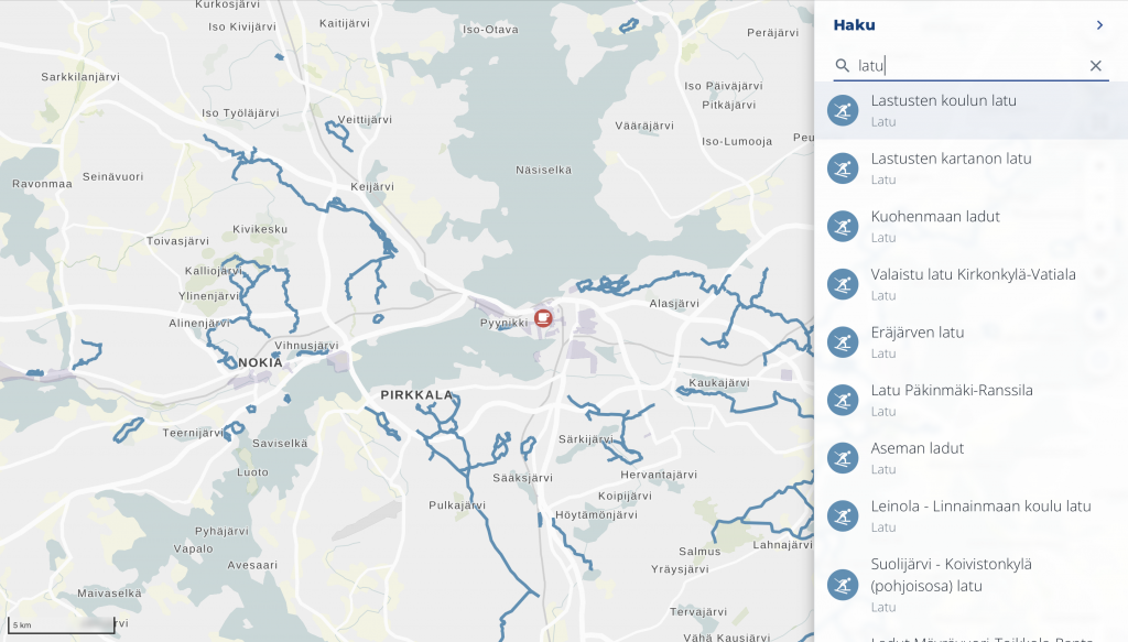
You may have noticed that outdoorstampere.fi actually has a functional, albeit simple, search box built in. Start typing a string, and you are shown all the objects in the area containing that string in a split-second. Click on one on the list and it will center the map to the corresponding feature. It was so fast that we had to slow it down not to confuse the user, because interim results would show up and confuse the user whenever they would start typing.
How is it implemented, then, if there is no API whatsoever to the data? Well, there kinda is. In addition to rendering vector tiles, pg_tileserv knows how to query the database with any filtering expressions. This means our UI can actually request tiles from the server with a URL containing any database queries in CQL. This allows us to actually create a Maplibre layer whose URL parameters change when the React state changes. At every letter, the layer is reloaded. This is implemented with
/**
 * Dynamic search point layer. Maxzoom defines the size of the tile
 * used to search for the input string when zoomed in.
 */

export const SEARCH_POINT_SOURCE: VectorSource = {
  type: "vector",
  tiles: [
    `${process.env.TILESERVER_URL}/kooste.all_points/{z}/{x}/{y}.pbf?filter=${cityFilterParam}%20AND%20(name%20ILIKE%20'%25{searchString}%25'%20OR%20type_name%20ILIKE%20'%25{searchString}%25'%20OR%20tarmo_category%20ILIKE%20'%25{searchString}%25')`,
  ],
  minzoom: 0,
  maxzoom: 6,
};
If this looks ugly, don’t worry; we just happen to have a few CQL expressions in all the URLs thrown in for good measure. Firstly, we have a city filter that is actually defined as const cityFilterParam = cityName%20IN%20(${process.env.CITIES}); . This one will only load features having the right city name strings, so we don’t load data outside our area of interest. {searchString}, then, is a placeholder string that can be replaced with the current React props in the Map render method:
{/* Dynamic search layer*/}
<Source
 id={LayerId.SearchPoint}
  {...{
    ...SEARCH_POINT_SOURCE,
    tiles: [SEARCH_POINT_SOURCE.tiles![0].replaceAll('{searchString}', searchString)],
  }}
>
  <Layer
    {...{
      ...SEARCH_STYLE_CIRCLE,
      filter: categoryFilter,
      layout: {
        visibility: searchString === "" ? "none" : "visible",
      },
    }}
  />
  <Layer
    {...{
      ...SEARCH_STYLE_SYMBOL,
      filter: categoryFilter,
      layout: {
        ...(SEARCH_STYLE_SYMBOL as SymbolLayer).layout,
        visibility: searchString === "" ? "none" : "visible",
      },
    }}
  />
</Source>
So, when the user starts typing a search string, the search layer appears and reloads the tiles whenever the string changes!
The caveat here, of course, is that this is still a tiled server. There is no way you can do a global search to all the map data when the map is zoomed in: the map only loads those tiles that are visible at the moment.
It depends on the intended usage whether this is a feature or a bug. In general, of course, the user might be interested in their surroundings, not a location very far away; and luckily, ours is a local, not global, map service. The easy way around this is not to provide the search layer with too large a zoom. In our case, the maximum zoom level for the search layer is 6, which means that whenever the user is zoomed in, the search will happen on the local tile on that zoom level. It pretty much covers the whole area of our map.
Another way to handle the situation would be to zoom out whenever search starts, to indicate to the user that we are searching on a larger area. However, we think the user may not want to lose the local context, so we rather just display the list of the results and allow the user to click on them to pan to the selected feature at the current zoom level.
Conclusion
This shows you that pg_tileserv is actually a very fast queryable client to your PostGIS instance. When indexes are set up correctly for all the fields you want to filter with, any queries to the database really produce tiles lightning-fast. And React bindings to Maplibre allow you to create a UI that a) instantly loads different data depending on user interactions, and/or b) styles the existing data differently depending on user interactions, UI state and the data itself.
Since pg_tileserv can do PostgreSQL queries, it can of course also query e.g. PostGIS functions. We haven’t yet tried out layers that are dynamically generated on the backend by simpler or more complex SQL functions. They might come in useful in a variety of use cases in the future, though. Similarly, Maplibre on the frontend is constantly evolving, getting close to v3 release at the moment, providing new ways of visualizing our vector data. In all, the two feel like a very promising combination of cutting-edge technologies that allows developing fast and responsive web maps for a long time to come.
All the code of outdoorstampereregion.fi, including the snippets presented here, is open source and available on Github.
Children in all parts of the world should have the right to education, and many do. But in order for children to be able to actually use this right, there also needs to be a school within a reasonable distance. Here the schools’ physical locations play a pivotal role, and governments also have an obligation to place schools in locations where pupils can reach them in travel times adapted to their age, while at the same time ensuring safe and direct school routes. However, the lack of tools for analysing school accessibility has often proven to be a bottleneck.
Gispo has worked together with The International Institute for Educational Planning (IIEP), that is an arm of UNESCO, to improve the methodologies used for analysing school placement and accessibility. The final result of the collaboration project with UNESCO is a QGIS plugin called “the Catchment” developed and published by Gispo.
In order to make the needed analysis, ministries of education and local authorities can now use catchment areas. A traditional bird’s-eye view is not enough to estimate the reachability of a point due to its incapability to take enough terrain-related factors into account. For instance, a large hill or lack of roads between a home and a school would greatly affect the time needed to make the journey. Physical proximity requires the use of isochrones to determine the catchment areas, i.e. defining the area which is actually reachable from a single point within a given time. By using georeferenced data of population and school locations, it is possible to estimate and analyse whether or not a potential learner can be serviced by the education system within reasonable distance and how the situation could be improved where needed.
The Catchment plugin calculates isochrone-based geographical catchment areas and relies on a GraphHopper backend and OpenStreetMap data to perform the calculations. The user can select the parameters for calculation such as a desired point or a whole point layer, travel mode (walking, cycling, driving) and travel distance. The customisation of the plugin allows the user to choose how the results are presented. For example, the resulting isochrones will be individual units for each school by default but it is also possible to merge all the distance polygons. It is also possible for users to add indoor walking distances like the time spent walking from the school entrance to the classroom since it can be a factor in big schools that have buildings in different locations for different classes.
The published IIEP paper includes case study examples, such as analyses done with school data provided by the Jamaican Ministry of Education, Youth, and Information. One analysis resulted in the following visualisation (Figure 1) that describes the travel times around Central Branch Infant School in Kingston, Jamaica. Given how topographically diverse Jamaica is, its characteristics served as an excellent example for a scenario where this analysis is useful.
The different colours in Figure 1 represent different ranges of time spent by a potential learner travelling between their home and the school whilst the black circle delineates the 5-km straight-line buffer around the school. The analysis shows that it is possible for a student to live within the 5-km radius even though some areas within the buffer might make it topographically, or in terms of road connectivity, impossible to travel to the desired school within a reasonable amount of time. In other words, there can be an illusion of services.
Going to school is still a daily challenge for many people and for that purpose the isochrone methodology can provide insightful and useful results that can be used for further analysis and planning. Thus, the Catchment plugin can be used especially to improve access to education, but also to estimate the potential number of students in schools, to optimise delivery routes or to calculate school inspection routes.
The source of the content in this post and the full UNESCO-IIEP and GISPO paper is available here.
More in depth take on the plugin and how it works can be found here.
Plugin is available in the QGIS plugins repository.
The QGIS plugin source code can be found on GitHub.
This article is written by Anna Saarinen