This article provides an overview on procuring Free and Open Source Software for Geospatial (FOSS4G). Procuring refers to purchasing work related to FOSS4G. In the process it’s not only important to ensure that the right supplier is chosen, but that contracts align with procurement needs and FOSS4G principles, and the final results support the objectives of the organisation.
FOSS4G projects follow open-source principles, necessitating specific considerations to support continuous development and sustainability. Engaging people with prior expertise on FOSS4G tools and related processes early in the procurement process can streamline operations and ensure the best use of available tools and expertise.
This blog post outlines three key procurement scenarios: acquiring a new FOSS4G tool (e.g., a custom tool for a specific use case), updating a software that is already in use, and customising an existing tool (such as GeoServer, QGIS or QField).
This blog article is by no means exhaustive, yet hopefully helpful. And while this is aimed to focus on FOSS4G, many principles presented here are not limited to it but apply to procuring other software, too.
Procuring a new tool
Be it standalone software, plugin or a service, it is important to define the organisation’s needs. These include not only use cases and objectives, but also required functionalities, possible hosting options and integration needs to other software or services.
Clear timelines and documentation expectations should be set from the beginning, even though defining a realistic timeline can be challenging as different work phases require different amounts of time. The success of the project may depend on the systems that the new tool has to integrate with.
Updates to existing applications
Understanding the current system version, past updates, and any customisations is essential. For software that has been set up “as is” (such as GeoServer) and has not been customised, the updating is usually quite straightforward and well documented when updating between consecutive versions. Longer gaps between updates require more effort.
For updating, ensuring that the service has proper documentation that’s been maintained constantly helps track changes and improvements over time. It may also guide through common pitfalls of the updating process of that specific service or even help to avoid them.
Highly customised applications may pose additional challenges, making well-maintained documentation even more crucial.
Customisations and new functionalities
Organisations should evaluate their current and future needs, determine whether the customisation is for internal use or broader contribution, and maintain comprehensive records for future reference.
Before developing new functionalities, it is beneficial to check for existing solutions (ie. going through has someone already done something that could be of use in your use case).
Collecting and prioritising ideas for development teams helps streamline the process: if you gather together all the ideas that you have and hand them over to the development team, they can see which are top of your priorities now and what kind of things to expect next – and also suggest to you which of your ideas could be fulfilled at the same time quite easily.
All new functionalities should be properly documented, and organisations are encouraged to contribute improvements back to open-source repositories for long-term sustainability.
Considerations before and after procurement
Before procurement, organisations should assess existing infrastructure and potential integration requirements. Hosting, security, and database needs should be carefully considered. For some FOSS4G tools hosting and database are not required yet for public map services they can be essential.
After procurement, assigning an administrator for the system ensures smooth operation. The admin should be in the know about the update needs and the possibilities of the newly implemented system. After the system is up and running it should be promoted within the organisation (and if it intended for public use, to the public / target group) to maximise its benefits and to make sure that it actually gets to benefit the end-users as intended.
One thing that should not be forgotten in the midst of procuring a FOSS4G tool is the support and training for the tool. You might need training in the use of that software / service, whether it is the training for the admin, the team that will be using it or if the key persons change over time and the knowledge has to be passed on to new people. Or then there’s a need for flexible support (for example, via e-mail) as “an insurance” that makes sure that in case of an unexpected error there’s someone to reach out to for help.
Documentation
We cannot overestimate the importance of documentation. Maintaining thorough documentation ensures smooth updates and maintenance. It should provide details about implemented customisations, locations of key files, and clear instructions for future developers or administrators. The documentation should be comprehensive enough for a person who hasn’t been in the original development team to continue the work.
Closing Thoughts
Effective procurement facilitates ease of use for administrators, developers, and end-users while supporting the long-term success of FOSS4G solutions. Even though this article gives many viewpoints and lists various things to consider, the most important thing is, after all, to procure solutions that answer your needs and make your work easier.
What is this post about?
Last year we at Gispo got to work with the National Land Survey of Finland on a project focused on QGIS Server. We learned a lot during said project, and this blog post aims to share some of that as a practical introduction to QGIS Server. Topics include: what is QGIS Server, why should you care about it, and how to publish maps with it. To provide an example, we set up QGIS Server to publish a WMS as well as a map atlas of print-ready maps. A small example project is included as a hands-on example.
Why consider QGIS Server?
QGIS Server publishes maps and geospatial data to the web via the standard OGC web services (WMS, WFS, OGC API for Features etc). While this alone is not particularly exciting, QGIS Server does have a couple of unique characteristics that differentiate it from any other server for geospatial data. The gist is that, as the name suggests, QGIS Server is highly integrated with QGIS. For example, you can configure and publish your web services within QGIS, directly from your QGIS projects. What is really cool – perhaps the single most important feature of QGIS Server – is that the integration with QGIS extends to styling the maps as well: Once published, your maps look identical to what they look like in your desktop QGIS.

Another unique characteristic of QGIS Server is its capability to serve QGIS print layouts. So, in addition to styling your layers with QGIS, you can use all the print-layout-specific features of QGIS as well: legends, map frames, or even publish a map atlas on the web.
Getting started with QGIS Server
There are many ways to get started with QGIS Server and, of course, what way is best depends heavily on context. In this post we go for a containerized approach. This is convenient as it means we can get a working server configuration up and running very quickly and without a ton of installations on our own system – a container engine, such as Podman or Docker, is all that is needed to get started (for a detailed description of the alternatives in setting up QGIS Server, the official documentation does a great job).
Let’s grab the QGIS Server image. Note to edit the version if needed: Since the project configuration happens through QGIS Desktop, it is best to match the versions of QGIS Desktop / Server when preparing projects.
docker pull qgis/qgis-server:3.40Also, while we use the official image here, it is worth noting that it is by no means the only container implementation – there are numerous different container images of QGIS server, all with varying software stacks and configurations.
Now, running the server becomes as as simple as:
docker run --rm qgis/qgis-server:3.40This obviously does not do much of anything yet: We have not given QGIS Server any QGIS projects to serve, nor have we exposed any ports to actually communicate with the server container.
Serving a project
Get your favourite QGIS project ready (any QGIS project will do). An example project is also included in the example repository.
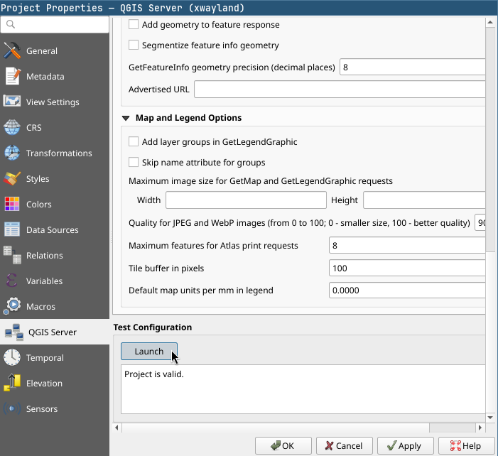
As mentioned before, configuring a QGIS project to be served happens from your desktop QGIS. In the Server tab of your Project Properties you have the options that directly relate to configuring your services: from the general services capabilities that generate your GetCapabilities document to service-specific settings such as your WMS extent or published / excluded layers.
Now that we have a project ready to go, QGIS Server has to be able to access it (and its data). Since we are dealing with containers, we’ll need to mount a volume containing our QGIS project and its data into the container. We’ll also need a way for us to communicate with the server container, so a port on our host machine should be mapped to the container port where QGIS Server is listening.
As we start specifying more conditions for our container, it is best to move to using a compose.yml file for defining how we want our container to run. So, the above translated to a compose file:
services:

  qgis-server:
    image: qgis/qgis-server:3.40
    container_name: example-qgis-server
    ports:
      - 8080:80
    volumes:
      - ./data:/io/data
Now we can start the server with docker compose up -d. Our local project directory (./data) is mapped to /io/data in the container, where QGIS Server is configured to look for projects to serve. The default port of the server container is mapped to local port 8080 meaning we can access the server on localhost:8080.
Let’s try the WMS. The container implementation we are using expects our request urls to be prefixed with /ogc/<project-name> for QGIS Server to find the project. The example project is named example_project.qgs, so a valid request could be, for example:
localhost:8080/ogc/example_project?SERVICE=WMS&VERSION=1.3.0&REQUEST=GetCapabilitiesPublishing & configuring layers
By default, the layers in your QGIS project are the layers that are published by QGIS Server. How you style the layers in QGIS is, cartographically speaking, the layer configuration (the Server settings in project properties have the service-specific options). One other helpful thing when it comes to layer publishing is layer grouping. By grouping you can publish single layers that are made of many other layers – requests can just pass the layer group’s name to the LAYERS parameter of GetMap.
http://localhost:8080/ogc/example_project?SERVICE=WMS
&VERSION=1.3.0
&REQUEST=GetMap
&LAYERS=wms_group
&CRS=EPSG:4326
&WIDTH=1000
&HEIGHT=750
&BBOX=28,119,43,139
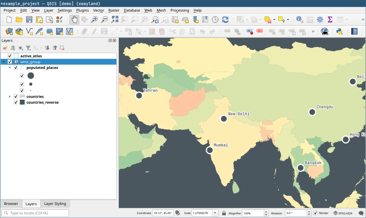
The example project has a layer group with three layers. We can request for all of them by specifying the group in the request.
On the topic of layer configuration it is also worth noting that QGIS can do a lot more than apply static styles. This has immense potential as we can define many aspects of the published maps to be dynamic. For example, in the example project the visibility of the populated places is controlled with a rule that shows different cities based on zoom level. This translates directly to how the layer works through the WMS: We see different cities depending on our zoom level just like in desktop QGIS.
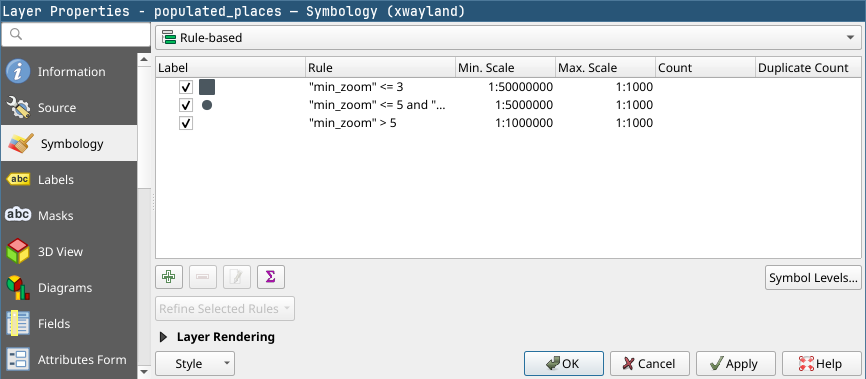
Layer symbology settings and two WMS responses at different scales. The published layers fully utilize QGIS for styling – for example when defining rule-based symbology.
Serving a map atlas
QGIS Server extends the WMS-specification with a GetPrint request. With GetPrint we can request print layouts from QGIS projects by specifying the desired print layout with the TEMPLATE parameter, and the response will be the entire layout instead of a single map image. Since a print layout can have multiple maps, the parameters of individual maps are controlled by prefixing them with the id of the map item, for example map0:EXTENT. All the GetPrint specifics are documented in more detail in the docs.
Where the capability to serve print layouts really shines is when it is combined with the atlas functionalities of the print layout. We can define a map atlas in QGIS, and then request parts of it from QGIS Server by using a GetPrint request together with the ATLAS_PK parameter. This parameter works with the coverage layer of the atlas, allowing us to specify which parts of the atlas we want to request based on the atlas page name.
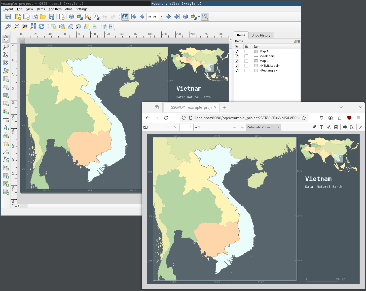
For example, in the example project we have a print layout named country_atlas. It has a map atlas that uses the country layer as the atlas coverage, and the layer’s “fid” column as the atlas page name. Thus, a request for atlas pages 1 and 2 (so countries with fid 1 and 2) would look like:
http://localhost:8080/ogc/example_project?SERVICE=WMS
&VERSION=1.3.0
&REQUEST=GetPrint
&FORMAT=pdf
&TEMPLATE=country_atlas
&CRS=EPSG:4326
&ATLAS_PK=1,2
And our response:
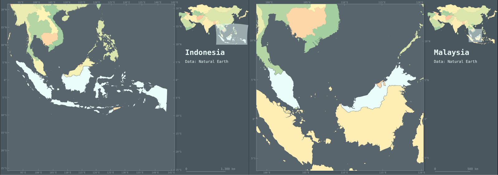
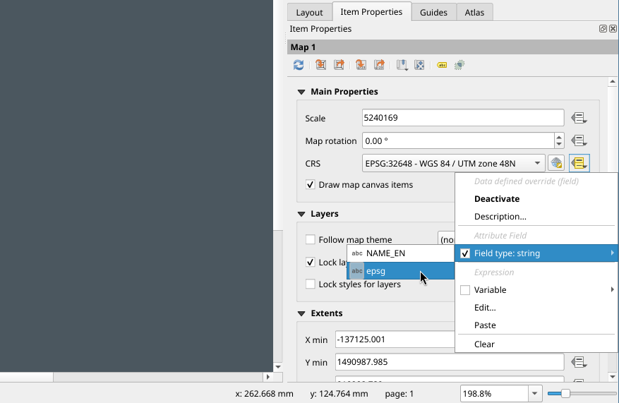
One final QGIS feature that has to be mentioned especially in the context of serving atlas maps is the ability to specify data defined overrides for nearly any parameter in the print layout. This means that we can manipulate the atlas pages with, for example, expressions or attribute values. In the context of atlas maps, overriding parameters using attribute values enables us to use the attributes of the coverage layer as values for the parameters. In the example country_atlas layout, we control the main map’s projection with the country layer’s “epsg” attribute. This attribute simply holds an epsg code for every country, and depending which country we request, the projection changes based on this code automatically. So, no matter what CRS we specify in the GetPrint request, we always get a map projected in a predetermined CRS for the specified country.
What’s next?
While this post already touched on some quite novel ways to craft map services, it really is just scratching the surface of what is possible with the tools presented. And, of course, QGIS Server integrates with tools other than QGIS as well: for example, we could use a PostGIS backend to store our data (or even QGIS projects) that we intend to draw into maps and serve with QGIS Server. Also, just like QGIS, QGIS Server supports plugins written in Python, meaning its capabilities can be extended even further relatively easily.
All in all, integrating QGIS with the capabilities of a map server enables a high degree of customizability and allows for functionalities that could benefit quite a few use cases. If you think yours is one of them, do reach out!
Gispo has been part of the EU’s EIS (Exploration Information System) Horizon project for the past couple of years. The project’s aim is to aid the EU’s efforts in the green transition by securing critical raw materials. The project consists of several work packages ranging from conducting research to raising awareness of the importance of minerals in the green transition. We at Gispo have been most involved in a work package that aims to develop innovative software for mineral prospectivity mapping (MPM). Aside from software development, a large part of the work package has been planning, comparing existing methodology, arranging workshops, and holding interviews. We have discussed the project in two of our previous blog posts: you can check them here and here. Now, as the project is approaching its end, it is time to look back at what we have achieved.
During the project, Gispo has been developing two software applications : EIS Toolkit and EIS QGIS Plugin, with our partners Geological Survey of Finland (GTK), Beak consultants GmbH, University of Turku, and French Geological Survey (BRGM). EIS Toolkit is a standalone Python library which brings together and implements relevant tools for mineral prospectivity mapping. It is the first free open source software of its kind. To make using EIS Toolkit as easy and efficient as possible, EIS QGIS Plugin was created to provide a graphical interface for each individual tool and to implement EIS Wizard that provides guided workflows for MPM. GTK has been the main responsible party for developing EIS Toolkit and EIS QGIS Plugin development has been led by Gispo.
EIS Toolkit
Let’s have a look at what the two software applications contain. EIS Toolkit has a number of tools used in MPM. The tools currently implemented in the toolkit are divided into nine categories: conversions, evaluation, exploratory analysis, prediction, raster processing, training data tools, transformations, utilities and vector processing. Most categories contain several tools, but let’s go through just a few here. The full list of implemented tools can be found here.
Conversion and transformation tools are quite straightforward. Conversion tools can be used, for example, for taking raster pixel values and putting them in a Pandas dataframe. With transformation tools, you can e.g. binarize or normalize raster data, or perform transformations on compositional data (CoDa transformations).
Exploratory analysis tools are for exploring data using various plots, statistics and data transformation methods. These tools include algorithms such as K-means clustering, principal component analysis (PCA), and Local Morans’ I. All basic distribution and relational plots are included along with some more specialized plots like parallel coordinates plot.
Raster processing tools are for manipulating and preprocessing raster data. Using them, one can for example clip raster extents using polygons, snap rasters to grids and create distance rasters. With vector processing tools similar preprocessing tasks can be performed such as calculating distances from raster cells to the nearest geometries, performing IDW or kriging interpolation, and rasterizing vector data.
An important part of MPM is predicting the mineral deposit locations. The modeling module of EIS Toolkit focuses on ML models. The supervised methods include gradient boosting, logistic regression, random forest and multilayer perceptron. In addition to these tools, EIS Toolkit has fuzzy overlay and weights of evidence. For evaluating the performance of the ML models, EIS Toolkit contains tools for calculating different metrics, such as precision and recall, and visualization such as for plotting confusion matrix or prediction area curve.
The tools mentioned above form only a small part of all the tools included in EIS Toolkit. The toolkit is built to be modular and can be extended with new tools in the future.
EIS Toolkit is a Python package and as such, it can be used in Python scripts as a library. Since the beginning of development, convenience of use has been a priority. All of the tools are categorized, documented with docstrings and have a thought-through number of parameters, which should make the toolkit approachable. To get started with EIS Toolkit, we suggest creating an empty Python virtual environment with a compatible Python version and installing EIS Toolkit there.
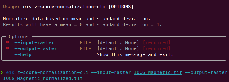
Since EIS Toolkit has a large number of dependencies, conflicts with the dependencies of other Python software are very likely to occur. This is why EIS Toolkit has an additional CLI API that is primarily intended for integrations with other software (such as QGIS). Using the CLI API, each tool can be accessed in a well-defined way by other programs that execute EIS Toolkit as an isolated Python process. The CLI API can be used directly in a traditional geoprocessing fashion too, but so far the focus has not been to make it a convenient interface for people.
EIS QGIS Plugin
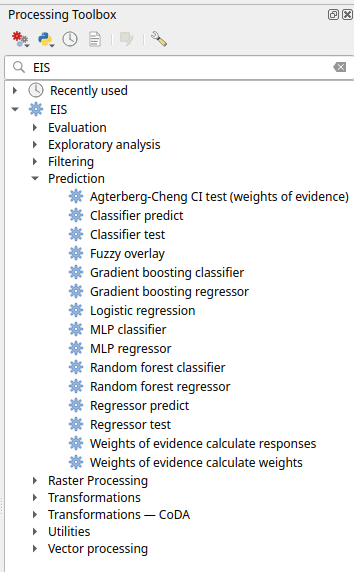
Next, let’s look at the EIS QGIS Plugin. It consists of two parts: EIS QGIS processing algorithms and EIS Wizard. The processing algorithms can be accessed from QGIS Processing Toolbox.
A more guided way to use the plugin is via EIS Wizard. It is a GUI ( graphical user interface) designed to perform MPM workflows in a structured way. EIS wizard consists of pages that are designed to be walked through from top to bottom in general, but in a non-restrictive way that allows switching pages whenever the user wishes so. The pages of EIS Wizard are Mineral system proxies, EDA, Modeling, Evaluation, History, Settings and About
On the Mineral system proxies page users can process their measurement data so that it can be fed into the prediction models. Users can use the provided default IOCG (iron oxide copper gold) mineral system proxies or create their own mineral systems with custom proxies. These custom mineral systems can be exported and imported as JSON files, making it possible to build a shared mineral system library in the future. Each proxy is associated with a workflow with one or more processing steps. The available processing steps are:
- Distance to features
- Distance to anomaly
- Interpolate
- Binarize
- Proximity to anomaly
- Proximity to features.
The output of a workflow is a proxy raster that contains some information that is believed to correlate with mineral deposit locations. The raw measurement data is processed to proxy form to filter out irrelevant pieces/noise, normalize data ranges and to facilitate a mineral system -driven approach for the modeling process among some other reasons.
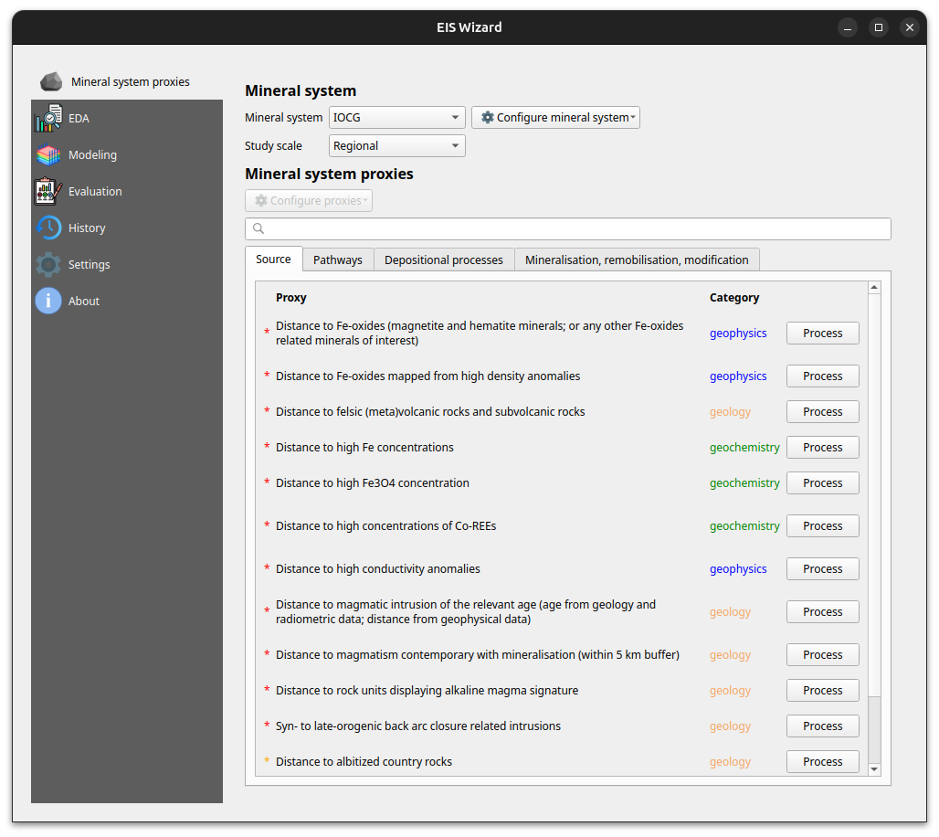
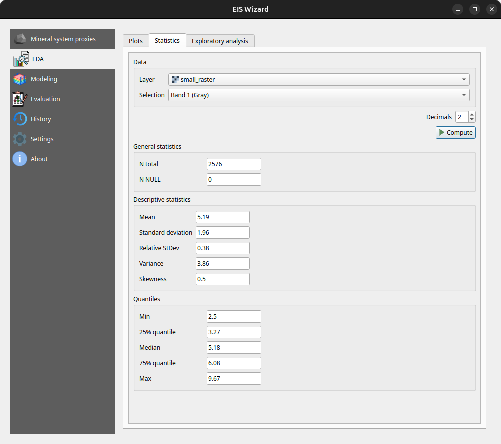
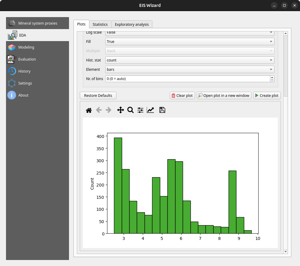
At any time, users can inspect their data in the EDA page: EIS Wizard enables creating plots for vector and raster data. Users can also compute different statistics from their data or use the exploratory analysis tools.
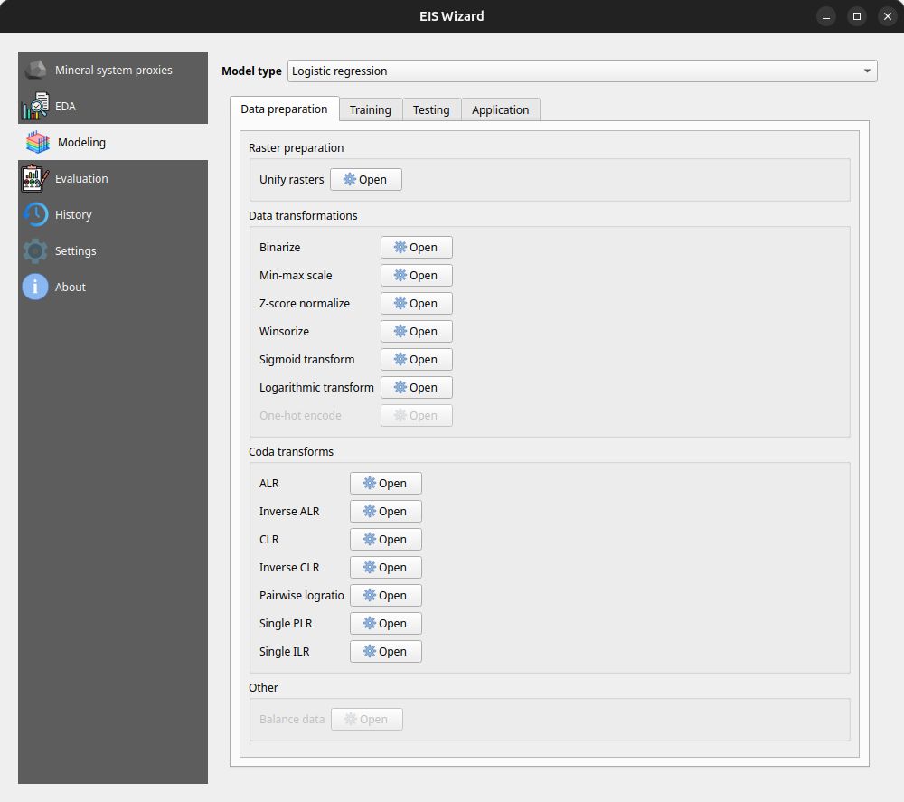
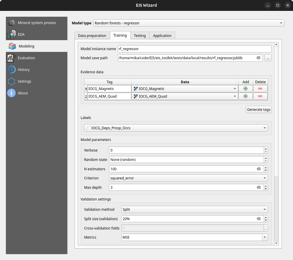
In the Modeling page, users can apply ML and data-driven models on their data. The page consists of a model selection dropdown menu and tabs for different steps in the modeling process. For supervised ML models the tabs are data preparation, training, testing and application. In the data preparation tab, users can prepare their data with several transformation tools before moving on to training the selected model with the data. After training and testing the model, it can be applied to classification/regression tasks on new, unseen data to make the actual predictions. Fuzzy overlay and weights of evidence don’t follow the same train-test-predict workflow and therefore have their own sets of tabs.
In the Evaluation page, users can evaluate their model by computing several metrics such as accuracy, precision, recall and F1 score. Users can also plot, for example, a confusion matrix or a ROC curve to evaluate the prediction results.
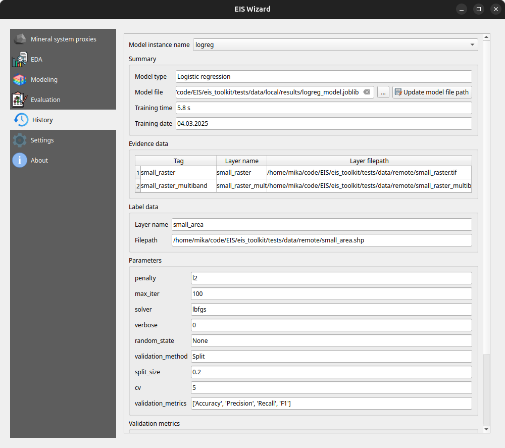
On the History page, users can view information about previously trained models whereas on the Settings page, EIS Toolkit configuration is set and various customizations to the user experience can be made. For a more thorough overview of EIS QGIS Plugin, please visit its wiki page.
Retrospective
The project has been largely successful in terms of the software work package. We implemented a wide range of tools, with EIS Toolkit reaching its full release in May 2024 and EIS QGIS Plugin last November. Since then, both software applications have received new features and undergone minor improvements.
However, not all planned features were implemented. The originally intended support for mineral systems beyond IOCG is missing, mainly due to dependencies on other work packages. To address this, we have provided users with the option to define custom mineral systems.
Overall, we are pleased with the project’s results and the potential impact of these tools. EIS Toolkit brings together relevant tools for MPM like no other free software before, while EIS QGIS Plugin offers a user-friendly interface for navigating each step of the MPM workflow in QGIS. As open source software, they are freely accessible without licensing costs. We look forward to seeing them adopted by geologists and mining professionals. If you feel that some tool that is important for your workflow is missing, or you need help with using either software, don’t hesitate to reach out.
Plugins give a boost to your work
Plugins are available for many purposes in QGIS and can add many new levels to your work! Plugins are additional functions developed for QGIS and they are developed by individual developers or, for example, by an independent company. Plugins can be used to extract building data from a specific area, to create interactive maps or to create an elevation model into a slope profile. Now we will look at some of the QGIS plugins favoured by Gispo workers and their various use cases. The main reason why we introduce these specific QGIS plugins is that we work especially in the Finnish geospatial data field. Can you find your favourite among the list?
DigitransitGeocoding
This plugin is intended for geocoding Finnish addresses and locations in the QGIS project. Geocoding allows you to conveniently search for different addresses and places in QGIS just by typing the name of the address or place you are looking for in the search field! To use this plugin, all you need is an API key, which can be easily obtained from https://portal-api.digitransit.fi/. To use the plugin, you need to create a global variable DIGITRANSIT_API_KEY in QGIS and set the API key to its value. More detailed instructions on how to create an API key can be found on the Gispo blog (written in Finnish). For example, in the image below, all roads in Finland with the name Mannerheimintie have been retrieved.
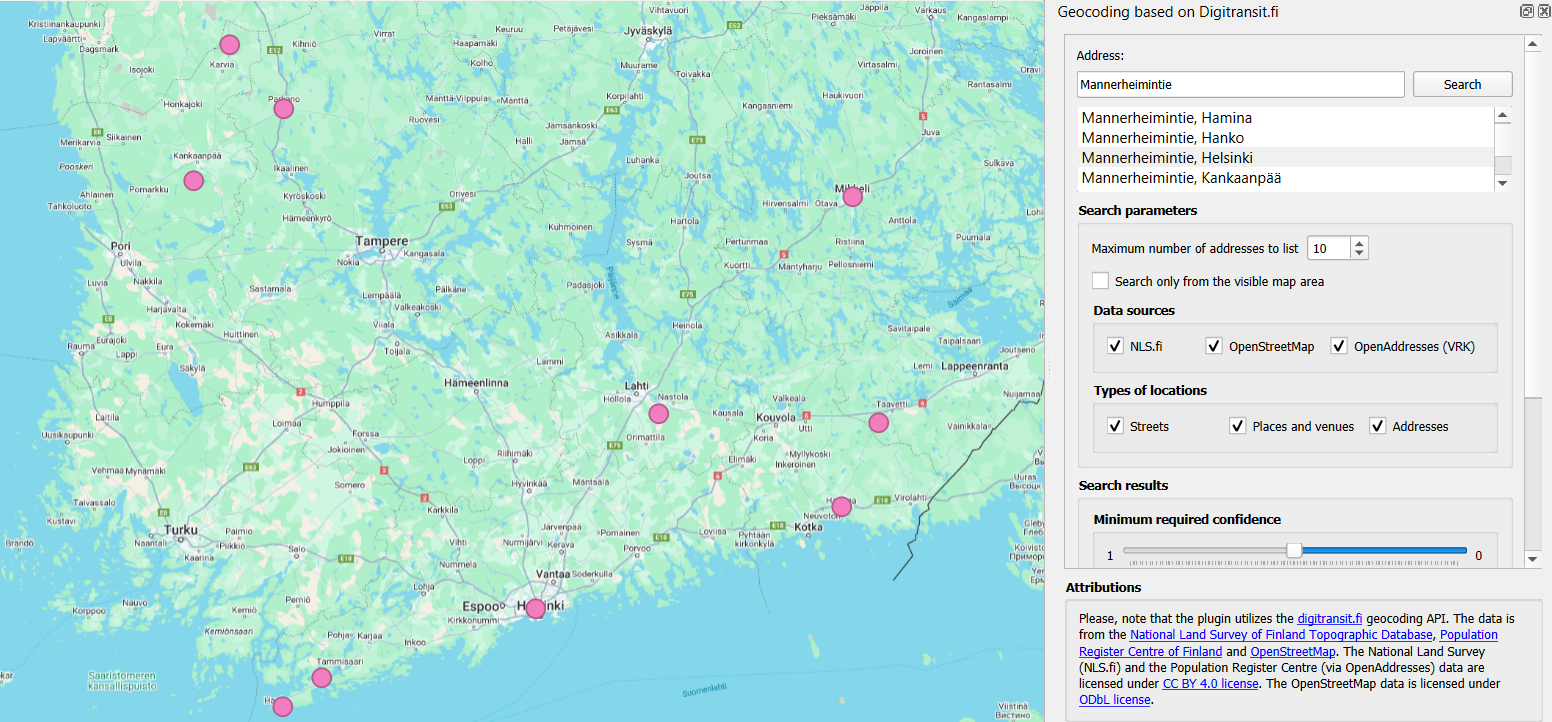
The address was retrieved with the DigitransitGeocoding plugin. The plugin creates a point layer of the address, making it easy to detect and visualize the address location.
Qgis2web
The Qgis2web plugin allows you to export your QGIS project as an OpenLayers or Leaflet web map directly into your browser. This plugin copies as many parts of the project as it can, including layers, scopes and different styles. The plugin also takes into account possible style classifications and grading when including styles. This plugin easily transfers your project to the browser, where it becomes a handy interactive map!

Interactive map of the noise pollution caused by the railway in the Helsinki city centre, transferred from the QGIS project to the browser using qgis2web plugin.
MapSwipeTool
This plugin allows you to compare two map layers. The map layers are superimposed on each other, allowing you to compare land use changes over different years from aerial photos, or the effects of flooding in a particular area before and after! The comparison is made by sliding the line in the middle of each map layer to the right and left, so that one map layer is always compared with another in the same area and the differences are quickly visible. This plugin is also useful for comparing georeferenced data, for example!

Comparison of aerial images of Helsinki in 2014 and 2023 using MapSwipeTool plugin.
Profile tool
The Profile tool plugin allows you to draw a slope profile from your own elevation model in a QGIS project. A line is drawn on the graph to represent the height variations of the elevation model. As you move the mouse over the slope profile, you can see in real time where each degree of elevation is in the elevation model. A handy plugin to get all the information out of elevation models, for example for use in watershed analyses! The diagram can be saved as svg, png, csv or pdf files.
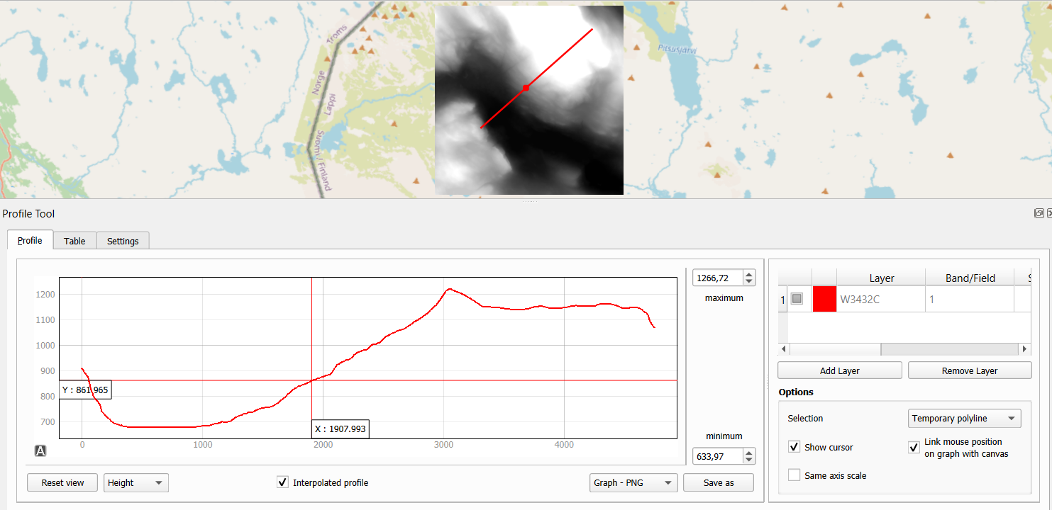
Examining elevation differences in the Lapland area using the Profile Tool plugin.
QNEAT3
With QNEAT3 you can easily perform a variety of geospatial analyses on your road network data. Whether you want to calculate the shortest route from point A to point B or create an interpolated surface from the distance between two points, this plugin has the tools to solve your toughest spatial data problems! The plugin includes tools for calculating the fastest or shortest route, as well as various Iso-Area analysis tools for creating point clouds and interpolation layers from road network data, for example.
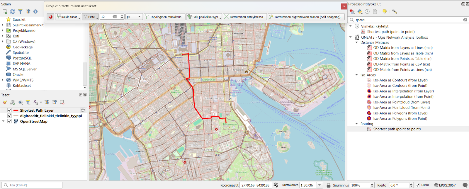
The fastest route from Helsinki Central Station to Tähtitorninmäki calculated with QNEAT3 plugin.
Psst! You should click the snapping tool active in the QGIS project to grab the road network layer. This will allow the plugin to calculate the route, for example, even in a situation where the starting point is in a forest far from the road network.
QuickMapServices
Still missing a suitable background map for your QGIS project? The QuickMapServices plugin is made just for this purpose! This plugin offers a comprehensive range of different background maps for your QGIS project. Whether you want a background map to match the background of your generated elevation model, or even a background for your spatial analysis to distinguish city roads and buildings. In this plugin you will find, for example, OpenStreetMap cycle route maps, City of Turku maps, Landsat satellite images and various Google maps. QuickMapServices plugin allows any individual or organisation to submit their own maps for publication via their website. Remember, however, that the license of the published material must be public if the map is to be included in this plugin!
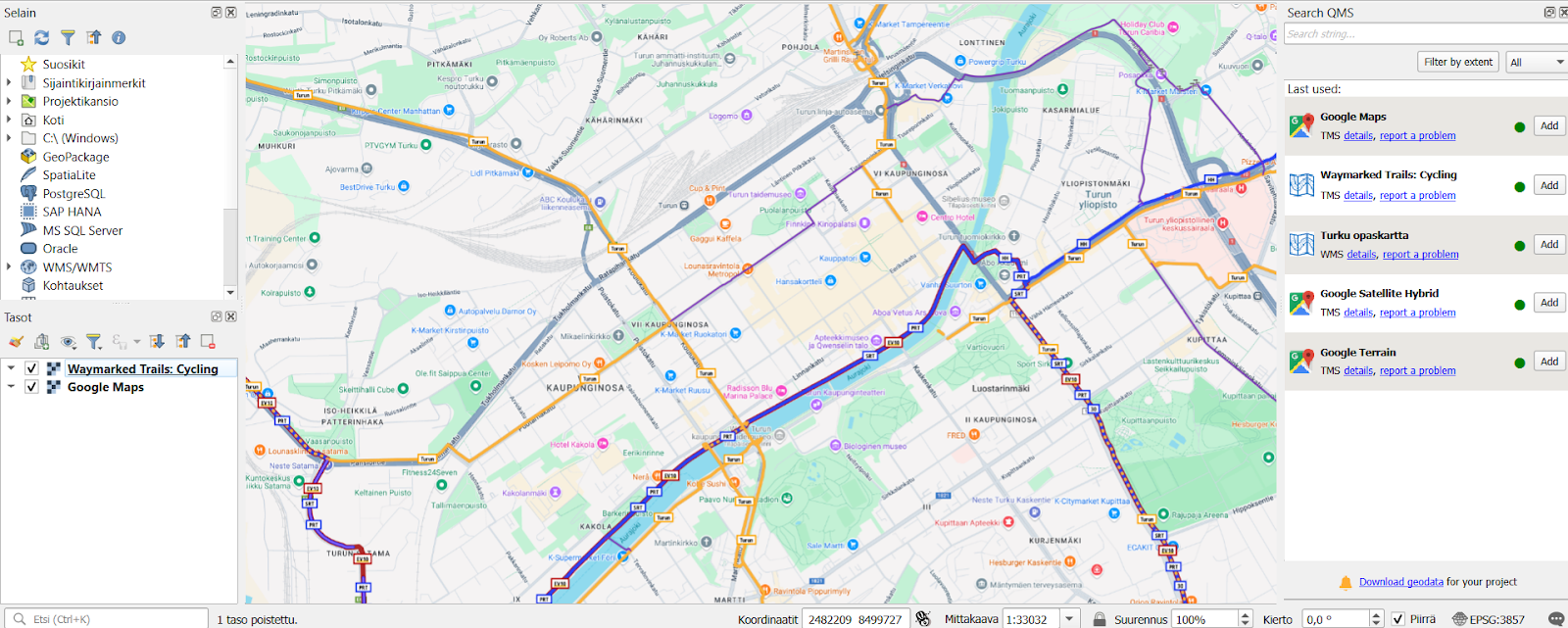
Map of cycling routes opened via QuickMapServices plugin and Google Maps map in the QGIS project.
Plugins for every need
Plugins are available for many different needs and can be used for a wide range of different spatial data problems. Plugins are also being updated and developed in QGIS and this development can be done openly by many different actors and organisations. Gispo offers a wide range of courses on how to use QGIS plugins, as well as a dedicated course on plugin development! There are already a huge number of plugins available for QGIS, so it’s definitely worth getting more familiar with the handy features of plugins and actively following their development. So don’t hesitate to try them out!
This article is written by Anni Jusslin
Three LiDARs have been monitoring traffic around Esplanadi in Helsinki from November 2023 to August 2024. The data was collected by Flow Analytics and it can be downloaded here: https://flow-portal.com/ (requires registration). After the data collection, all that was missing was a tool to analyze all this data.
We had the pleasure to work a project with Forum Virium Helsinki, the aim was to develop a tool capable of analyzing the data collected by the LiDARs and to conduct a small analysis on this experimental data. The end users of this tool would be the traffic researchers of the city of Helsinki. As LiDARs allow collection of more data than more traditional traffic counting methods, their use can be expected to increase.
We decided to implement the tool as a QGIS plugin which was named FVH-3T (Forum Virium Helsinki – Traffic Trajectory Toolkit). The plugin consists of two buttons and three QGIS processing algorithms. Its use is very simple: first, the user imports a traffic point layer into QGIS and creates an empty gate and area layer using the buttons in the Plugins toolbar. Next, the user draws gates and areas in locations where they wish to study traffic.
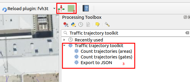
When the gates and areas are drawn, it is time to run a processing algorithm. There are three of them in the FVH-3T plugin: The first two are for the actual traffic census while the third one is for exporting the results computed by the gates into JSON-format. Before running either of the two “Count trajectories” processing algorithms, the user can set a desired timeframe for the calculations as well as the class of traveler. Running the processing algorithm creates trajectories from the point data and calculates some movement statistics both for them and the user-drawn gates/areas. Both processing algorithms can either be run as a single process, or split the studied timeframe into several smaller intervals ussing the QGIS batch processing interface.
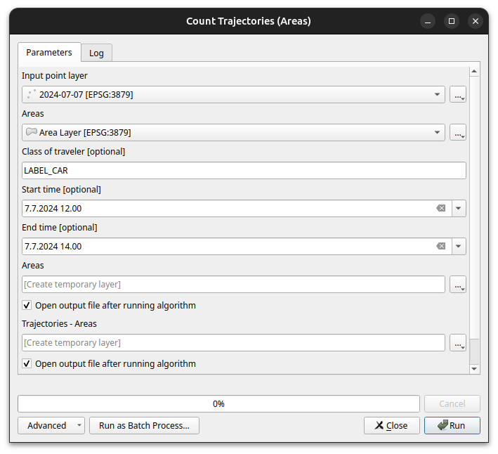
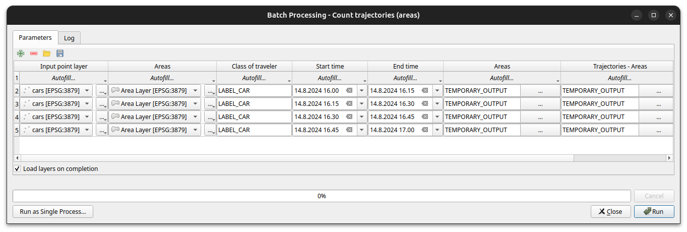
As stated above, running the processing algorithm draws trajectories from the point data. When running the “Count trajectories (areas)”, trajectories are generated only for points inside the user-drawn areas while when running the “Count trajectories (gates)”, trajectories are created for all points in the set timeframe.
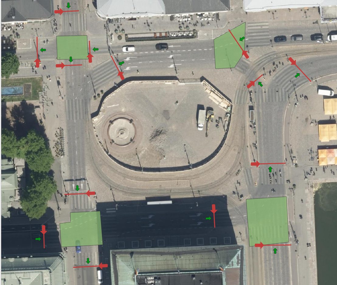
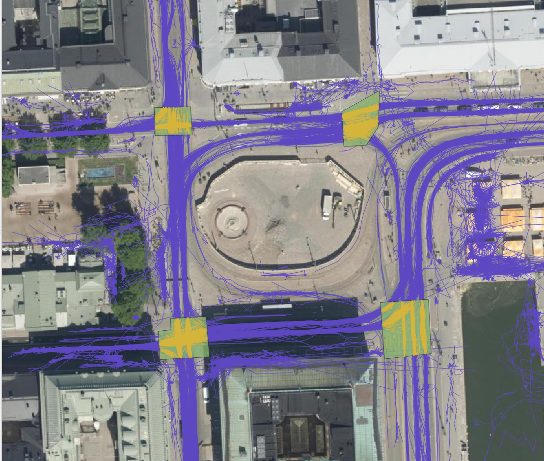
For each trajectory, length, duration, and average and maximum speeds are computed. For each area drawn by the user, the number of trajectories that it intersects are counted as well as their average speed. This allows, for example, to study congestion at intersections. For each gate, the number of intersecting trajectories per direction and the average instantaneous speed and acceleration of the intersecting trajectories are calculated. Gates are thus used to analyse traffic census. They can also be used to analyse pedestrian crossings.


The FVH-3T QGIS plugin can be used for analysing traffic flow on the general level as well as for more detailed study of individual travellers. Trajectories can be used, for example, to study how diligently pedestrians use crossings or whether many cross the driveways at the wrong place. Similarly, it can be studied whether cyclists use the cycle lanes intended for them, do they follow the intended direction of cycle lanes or do they find other paths. Gates can be used to study traffic volumes, speeds and accelerations at desired locations, and whether some cars or cyclists go in the wrong directions. With areas it is possible to analyse, for example, how badly intersections get congested.
In our small analysis, we discovered, for example, that car volumes were on average the highest on Fridays and lowest on Sundays during the observation period. In contrast, we did not observe any particular day of the week when average speeds at intersections were significantly higher or lower than average, but we did find some specific dates when the average speed in intersection(s) was lower than usual. These were usually days, when there were a lot of pedestrians in the area. For example, the 15th of August was one of these slower days, and on that date the Night of Arts brought several concerts to the area.
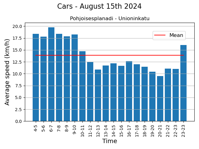
These eventful days also showed that the LiDARs were able to monitor individual pedestrians in the crowd. Regarding the pedestrian movements, we found, for example, that although the majority use crossings conscientiously, it is still quite common to cross the driveway at the wrong place. Similarly, although the cycle lanes in the Esplanadi area are in active use, some cyclists use the pedestrian lanes.
The project was interesting, not the least because we got develop a tool and the to try out the tool in practice, and also to learn the basics of traffic analysis. One of the greatest benefits of the tool is that the researcher can draw the areas and gates to those locations they are interested in and in the scale they are interested in.
As some of you might already know QField is a fieldwork app that’s compatible with QGIS. The application can be used to collect data from the field (outside the warm indoors office) meaning digitizing new features to layers, updating attributes of existing ones, altering the already digitized geometries or deleting earlier features. These all are very basic processes and features that many GIS experts know and use on a daily basis, yet many do the process of creating new features manually every single time.
In this article we will introduce you to forms – a feature that requires a bit of your time when setting up the QField project, but saves a lot of time in the field. The tips here are aimed at QField users, but QGIS users who digitize a lot, will benefit from these features too.
What are the benefits?
Setting up forms makes it possible to fill in attributes with automatic values and using constraints that make sure that the data you fill in or edit is of a certain quality. Properly defined forms speed up data collection. The setting up forms is done in QGIS before the project transferred to QField and needs to be done only once for the whole project (unless you want to fiddle with it afterwards).
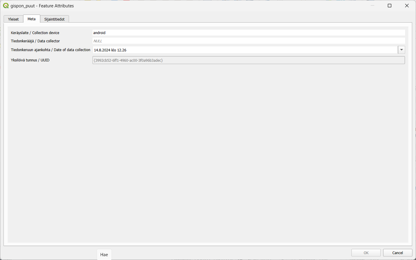
Some examples: a surveyor that wanders around the city collecting survey points and wants to automatically capture not only the location but also the timestamp (“it was 5:17:01 PM exactly when I saw a rabbit in this location”).
Another example could be when an inspector performs inspections and fills out inspection forms, their workflow would be more fluent if the inspector’s name and the date of inspection would be filled in automatically (“A newly planted rosebush, seen on March 15. by inspector Clouseau”).
Or if there is a group of people doing the fieldwork, instead of using free text fields where anyone can write whatever they like, the form can use drop down lists with fixed values (the value of the field is always “birch” or “spruce” instead of “spurce”, “spryce” or “bruce”).
A minor disclaimer before we dive into the forms any further: QField forms are similar to forms in QGIS but not exactly the same. Most of the same features are supported in QField, and those few that are not, are not there (yet) partly because the mobile interface imposes certain limitations.
What are automatic values?
Automatic values are values that are automatically given to certain fields according to specific criteria or rule(s). These are particularly useful for ensuring that certain fields are consistently and correctly filled out, without requiring manual input. The automatic values save time when collecting new features and reduce the workload of the collectors of the data.
Automatic value configurations are done in QGIS before exporting the project to QField. Open your QGIS project and navigate to the attribute table of the layer you want to configure. Right-click on the layer and go to Properties > Attribute forms.
One of the most used automatic values are timestamps. It will ensure that you automatically capture the time and date when a record is created or modified. Function for that is now().
You can set the format of the timestamp with the format_date function. For instance: format_date(now(),’dd.MM.yyyy’) returns the current date in the way we are used to here in Finland.
You can set other automatic values as well, for example:
- User Information: Automatically populate fields with information about the user who is making the change, such as their name or device ID. Functions:
- @cloud_username (returns the QField cloud username)
- @cloud_useremail (returns the QField cloud email),
- @user_account_name (returns current user’s operating system account name.),
- @user_full_name (returns current user’s operating system user name (if available))
- Location Data: Automatically capture the current GPS coordinates when a new record is added.
- @position_coordinate (returns a point with the coordinate in WGS84)
- All position functions can be found here
- To transform the coordinates received x(transform(@position_coordinate, ‘EPSG:3067’, @project_crs )), y(transform(@position_coordinate, ‘EPSG:3067’, @project_crs ))
- Incremental IDs: Automatically generate IDs for new records incrementally.
- @id – (automatically generate IDs for new records incrementally)
- Other useful:
- length($geometry) (returns Insert the length of the digitized line)
- $area (returns the area of the current feature)
- @qgis_os_name (returns current operating system name, e.g., ‘windows” or ‘android’)
- @qgis_platform -(returns current qgis platform, e.g. ‘desktop’)
- @qgis_version (returns current qgis version e.g. ‘3.34.5-Prizren’)
What are constraints?
Constraints are rules or conditions that are applied to data fields to ensure data integrity and accuracy during data entry or editing. Constraints help prevent invalid or incorrect data from being added to your GIS datasets.
Constraining the values you can make sure that the quality of the collected data is homogeneous and thus the data can be reused and refined. This is particularly important when the data is collected by various people. By limiting the values, for example, to a drop-down list you can make sure that each value is written correctly, can be compared to other values, and the likelihood of errors in data entry is significantly reduced compared to manually entering the information.
QGIS offers several types of constraints that can be set up through the field properties of a layer.
There are at least five different types of constraints:
- Expression-Based Constraints:
- Purpose: Apply custom rules to a field using QGIS’s expression engine.
- Example: You might require that ‘Area’ field must always be greater than zero.
- Setup: Define the constraint using expressions like Area > 0.
- Field Length Constraints:
- Purpose: Limit the number of characters allowed in a text field.
- Example: Restrict a ‘Zip Code’ field to exactly 5 digits.
- Range Constraints:
- Purpose: Restrict numeric or date fields to a specific range.
- Example: Ensure that a ‘Temperature’ field only accepts values between -50 and 50.
- Unique Constraints:
- Purpose: Ensure that each value in a specified field is unique across all records in the layer.
- Example: In a parcel dataset, each parcel ID must be unique.
- Not Null Constraints:
- Purpose: Ensure that a field is not left empty during data entry.
- Example: A field for ‘Survey Date’ in an inspection record should not be left blank.
So, next time you set up your QField project remember to keep in touch with automatic values and constraints!
Most QGIS plugins are written in Python. The QGIS Python API is powerful and the possibilities for creating plugins are extensive. There is however another, less well-known and used option — C++ plugins. Some of you might have used one without realizing it, the Geometry Checker and OfflineEditing are included in QGIS installations as core plugins and are written in C++.
So, let’s explore this world of C++ plugins and see how they work, how they differ from Python plugins and what are their advantages and disadvantages.
Short prologue on some programming concepts
Here I am going to explain some basic things about programming, hopefully in a way that is not too technical, just so we’re on the same page going forward.
If you have experience in programming you might want to skip to the section titled How C++ plugins work
What is programming anyway?
So, to start all the way from the basics, what even is programming? A program can be defined as a sequence of instructions for your computer to execute. Computers deal with numbers in the binary system so a program is basically a bunch of ones and zeroes that sit on your computer’s hard drive and can then be executed after which (typically) your operating system mediates the running of your program.
Programming then is the process of writing a program. So how does one do that? Do you just manually enter those ones and zeroes somewhere? That would seem difficult, right? Well, this is what programming initially was, people wrote code in raw binary. This binary format of code that can be executed by a computer is called machine code. Writing programs this way is obviously cumbersome and rarely done nowadays.
This is where programming languages come in. They are a way for people to use an agreed-upon notation to write programs in a format that is easier for humans to understand. However code written in a programming language really on its own is really just a bunch of text files that your computer cannot really do anything with. You still need a way to get the code into a format that can actually be executed by your machine.
Compiled and interpreted languages
To achieve this there are two different approaches, compiled and interpreted programming languages. C++ is a compiled language. This means that you use a type of program (called a compiler) to compile your C++ code into machine code. As a result you get an executable binary file or a library (more on this later). Windows users might be familiar with the .exe file extension, which denotes that a file is executable. On Linux and MacOS executables don’t have a file extension.
In contrast Python is an interpreted language which means that you have a type of program called an interpreter that in simple terms goes through your source code and executes it line by line. The way compilers and interpreters work is of course a lot more complicated and varied, but this is the rough distinction between the two.
Shared libraries
A library is a different format of compiled machine code which, unlike executables, cannot be executed on its own. In C++ there are two types of libraries, static and shared although here shared libraries are mostly relevant. You might’ve come across them already, on Windows they’re known as .dll (Dynamically Linked Library) files. Common file extensions for shared libraries on other operating systems are .so (e.g. Linux and MacOS) and .dylib (MacOS) files.
Once you have compiled a shared library you can link an executable program against this library. This means that you can use code from the library in your program. The code is loaded as needed by the executable program. Parenthetically if you’ve ever experienced some issue with missing DLL files, this is why — many programs expect a shared library to exist at some location.
How C++ plugins work
As we’ve learned Python code is executed by an interpreter, which is part of the QGIS installation (on Windows and MacOS). When installing a Python plugin its source code is copied to your QGIS profile’s folder and then used by the interpreter.
As for C++ plugins there is no such interpreter and the code has to be compiled into machine code. Based on the last section the solution hopefully becomes clear — you have to compile your plugin as a shared library. The library can then be loaded by QGIS and its code executed as intended.
You can either copy this shared library to an operating system specific folder that QGIS looks in, or you can tell QGIS to look in some other folder of your choosing. In Settings > Options > System you have a section called Plugin Paths where you can add a folder containing your shared library. After this the plugin should show up in the QGIS plugin manager and can be activated.
Why use C++ and why not?
Now that we know the basic idea behind C++ plugins, let’s talk about the reasons you might want to make one instead of a Python plugin and vice versa. C++ as a programming language can be quite divisive as I suppose many other (if not all) languages. Personally I really like C++ but even still I think it has to be acknowledged right off the bat that Python plugins have a lot of advantages over C++ plugins.
The case for Python plugins
Python plugins are going to be more stable and you can expect the same plugin code to work more or less the same across different QGIS versions. This is not the case with C++ and a plugin compiled using a specific QGIS version’s development libraries is unlikely to work with other versions.
There’s also the issue of compatibility between operating systems. Python code will be handled by an interpreter that will execute the code properly in the given environment. In order to provide a C++ plugin for different platforms you need to compile the plugin targeting each platform separately in addition to potentially having to provide versions of your plugin for different QGIS versions.
So a C++ plugin will require more work keeping up with different platforms and versions. Of course these processes can (and should) be automated which helps and also it’s not as if you are required to support every operating system and QGIS version. Overall maintaining plugin builds still likely requires more effort, especially to begin with.
Another advantage for Python here is installation, you can distribute a Python plugin from the OSGeo plugin repository and most users will be familiar with the installation process. Not that installing C++ plugins is extremely difficult, but it can be less convenient.
Generally speaking it’s likely that you’re going to have an easier time writing Python plugins as there is more documentation about it and more people doing (and therefore discussing) it. Python is a more approachable language and therefore probably easier to start with. Also depending on the type of plugin you’re writing some of Python’s features may be more convenient for the task.
The case for C++ plugins
The biggest reason to go with C++ is performance. Interpreted languages like Python generally speaking are slower (although the gap has been closing). There are ways to improve Python’s performance but C++ is still likely to be faster (obviously assuming you’re actually writing performant code). So this is the main reason you’d want to choose C++ over Python. If your plugin needs to do a lot of work and do it fast C++ will likely have the advantage.
If the point is to just get a plugin out and high performance is not a requirement then you probably should just go with Python. However if you’re more interested in the subject and have a personal preference for C++ it might be more motivating to choose it. As QGIS is written in C++ writing a plugin in the same language using its libraries might also be a stepping stone to get into contributing to QGIS itself.
Let’s say you need a performance-intensive plugin that you know would be mainly used in some organization where everyone is required to use one operating system and QGIS is updated with each LTR version, which would eliminate a lot of the effort of maintaining different builds of your plugin. I think a case like this would be quite well suited for a C++ plugin.
Conclusions
I hope this has been an interesting introduction to this subject and I hope you understand how plugins work within QGIS a bit better now!
Did you get interested in developing a C++ plugin? Covering the specifics of that is a bit outside the scope of this post, but I would recommend looking at this excellent example plugin on GitHub. It has great information to help you get started. To be clear, we’re not involved in the repository in any way — I just came across it while researching the subject and found it very helpful!
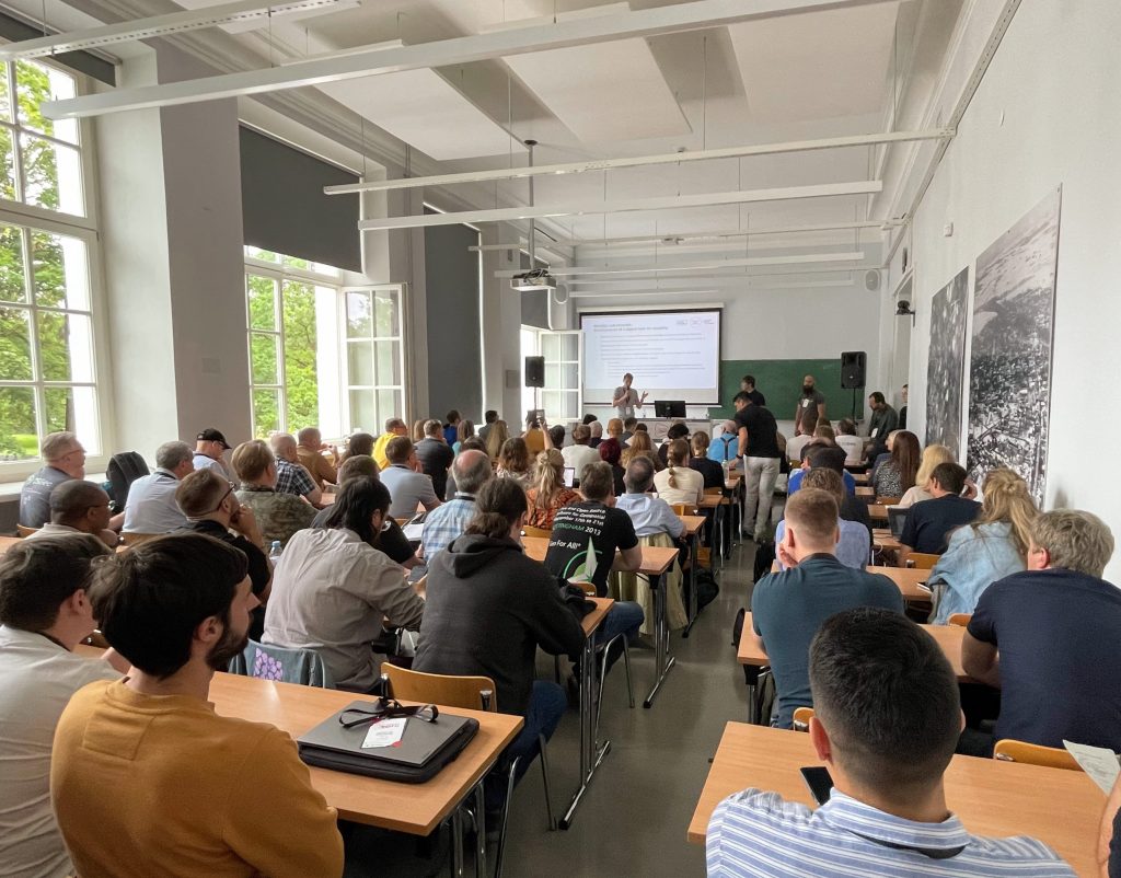
In the darkening autumn days it is fun to take a moment and remember the warm and sunny (partly also rainy) days of summer. In July GIS experts, software developers and all sorts of geospatial professionals traveled to Tartu, Estonia to attend this year’s FOSS4G Europe. FOSS4G of course refers here to Free and Open Source Software for Geospatial – meaning that the event was for everyone interested in such tools.

Gispo joined in with a team of 11. The event started with workshops where the participants had a chance to learn and try out new things in various geospatial technologies. This time our team was on the participant side but hopefully in the future Gispo will be holding a workshop at the FOSS4G event!
These events are excellent for learning about new technologies and features. We participated in numerous workshops, seminars and meet-ups. The topics of the conference had a wide range: we learnt plenty of new things about Maplibre, pygeoapi, G3W-Suite, GDAL, vector mosaicking with GeoServer, spatial cataloging and publishing with pygeometa and mdme, QGIS based topographic data management … and that’s just the first day!
One of the highlights was the news that it’s now possible to create plugins for QField (QGIS application for mobile devices). Our Juho got so excited about this possibility that he wanted to try it out straight away – thus becoming one of the early developers of QField Plugins! From the evening program the band Zetod definitely deserves a mention!
We took notes of the talks and presentations we heard and as one can imagine, this resulted in a whopping 53 page document. One might point out that the talks were also recorded and are available also afterwards. This is true but it doesn’t make the notes redundant. It is also fascinating to compare what a fellow gispolite took away from a session oneself attended as well.
This was not the first nor the last time we participated in a FOSS4G conference. As always, the atmosphere was friendly and warm and we had a great time. Our warmest thank yous to the organizing committee and all the friends old and new we met there. See you in the next one!
Recordings
Talking of the recordings, they have been released on Youtube. Our team gave seven presentations and to make it easy for you, here’s the list with links to the recordings with a small abstract:
Building Enterprise GIS with FOSS4G
Pekka Sarkola, founder of Gispo, gives a presentation that is targeted to ICT and GIS experts to better understand how to build Enterprise GIS with FOSS4G. Enterprise GIS is an organisation-wide collection of interoperable GIS softwares to manage and process geospatial information.
Enterprise GIS will follow basic principles of enterprise architecture. Enterprise GIS architecture is based on three layers: User Interface, Application Server and Data Storage layers. In this talk, he gives best practices to define and design Enterprise GIS architecture.
Planning for rainy days: optimizing school calendars with precipitation data and QGIS
According to a study in 2022, learning outcomes in Sub-Saharan Africa are negatively affected by rainy days mainly through the mechanism of teacher abstention. School calendars are largely shared within and across countries without taking local climatic conditions into account. This effectively means that the total number of school days in an academic year may differ according to different districts or other administrative levels.
The objective of this collaboration between Unesco IIEP and Gispo was to design a process that would enable any policy-maker in the world to look for patterns in periods of heavier precipitation in their country and to propose updated school calendars accordingly. As a result a QGIS Plugin was created to analyze precipitation data and produce school calendars.
Learning path with FOSS4G
There are multiple different ways to learn and teach the use of FOSS4G software. How to combine different platforms smoothly and how to get the most out of them is the problem new users are usually dealing with. One way to structure the learning is introducing learning paths to articulate the learning goals and the most useful path to navigate different learning modules and courses.
Complexity of Land use planning – simplicity from FOSS4G
There is an ambitious scheme in Finland to gather all the land use plans from municipalities and regions together in a harmonised manner in an open API service. This is a huge opportunity for FOSS4G since there are no tools available in any software to do this.
In this talk we shall briefly go through the current situation in Finland in land use planning. We focus on how to use PostGIS and QGIS in land use planning and bring simplicity to the complex database models. We present two use cases: Regional land use plan which can be done using QGIS attribute forms, and another for detailed zoning and land use plans, which require QGIS plugin development
Exploring the use of 3D tiles in QGIS – case Helsinki
The QGIS version 3.34 introduced support for Cesium 3D tiles. At the same time there is a growing number of 3D data published as 3D tiles. This is also true for the city of Helsinki, Finland, that has published diverse datasets as open data, including textured and untextured buildings, terrain data, and photogrammetry-derived mesh models.
We at Gispo conducted a pilot project that aimed to develop QGIS-based workflows for Helsinki to enhance the use of 3D data and 3D data production processes. In this pilot we integrated 3D tile datasets into QGIS and thoroughly tested out the new 3D tile features.
Managing airport data with Open Source Software
Nowadays the importance of geospatial data is growing for airport operators to efficiently manage airports inside and outside. In this presentation, we will show how FOSS4G software is used today to manage geospatial airport data and what are near-future challenges, like Foreign Object Debris (FOD), aerodrome mapping database (AMDB) and Obstacle management.
Before entering the aircraft, passengers like to easily check-in, pass security checks and then use various services, like restaurants, shopping, restrooms and other services. Airport outdoor and indoor maps are key tools for passengers to travel from outside the airport to the gate of the aircraft. We will show how to maintain a PostGIS database with QGIS, how to share necessary information with Geoserver and how maps are delivered to passengers to different devices.
Airport operators are mandated to collect, maintain and deliver aeronautical data of the airport. Aeronautical data is a key part of the creation of aeronautical information products which include both digital data sets and a standardised presentation in paper and electronic media. We will show how airport operator will collect and maintain aeronautical data in PostGIS database with QGIS.
How to set up a QGIS plugin project and development environment in minutes
Creating a new QGIS plugin and setting up a working development environment from scratch can be daunting, especially for beginners or occasional developers. In this talk, I present a templating tool that simplifies and streamlines the plugin development process. The tool is based on Cookiecutter, a well-known command-line utility that generates projects from templates. The template (https://github.com/GispoCoding/cookiecutter-qgis-plugin) we at Gispo developed:
- is highly customizable and follows the best practices for QGIS plugin development
- includes features such as testing, documentation, internationalization, packaging, continuous integration and development environment creation
- allows anyone to quickly start a new plugin project in minutes with minimal effort and consistent structure
Lauri demonstrates how to use the tool, how to modify the template options, and how to publish the plugin to the QGIS plugin repository. I also share some tips and tricks for developing and maintaining QGIS plugins. This talk targets anyone who is interested in creating or improving QGIS plugins, regardless of their experience or expertise.
In an era where data quality is paramount, the strategic management of geospatial data is a cornerstone in environmental data management. Accurate, coherent, and high-integrity data isn’t just a technical requirement—it’s the lifeblood of cities and other entities dedicated to protecting our natural world. To have ”Big data” means nothing, it’s all about having the right data.
In the pursuit of these objectives, minimizing manual labor in data entry and management is essential. It frees up valuable time for subject matter experts (environmentalists & co.), allowing them to focus on analysis and decision-making rather than data administration tasks. By streamlining the processes that handle complex environmental datasets, we can unlock new efficiencies and insights, driving forward the mission of nature conservation with precision and agility.
Now, let’s dive into the main value of this article. By implementing the OGC-based WFS-T protocol in your Enterprise GIS environment, you can facilitate secure GIS data editing by external stakeholders and others. The combination of PostgreSQL and GeoServer provides robust security management, while QGIS offers a user-friendly way to collect data for the end-users.
In this blog post, I’ll introduce an Enterprise GIS workflow we developed for the City of Tampere. I’ll focus on the practical steps and key technologies that facilitated smooth integration of the workflow. I’ll try to cover essential technological concepts to provide a clear and helpful guide, potentially aiding you to adopt a similar strategy in your own workflows.
Context: Geospatial Data Management for Nature Protection
When I first began working on this project with the City of Tampere, I was immediately drawn into a complex tapestry of environmental datasets, each characterized by a diverse array of field names and content. Understanding the nuances of these datasets presented its own set of challenges. Bit by bit I developed a deep appreciation for the critical role this data plays in the city’s environmental conservation efforts. It became clear that these aren’t just arbitrary sets of numbers and coordinates; they are the vital underpinnings supporting Tampere’s goals for nature protection.

So, basically our goal was to enable the city a process through which they could gather this data from the nature protection consultants in a secure manner.
In a process like this, it’s crucial to begin by asking ‘Why’ questions—many of them. By attentively listening to the city officials and understanding their business processes, we gained a comprehensive view of the various factors critical for managing this data.
This is where Gispo’s expertise and experience truly shine. Our customers often have headaches around different geospatial data management issues, and we try to help them as much as we can.
The Power Trio: PostgreSQL, GeoServer, QGIS
The City of Tampere extensively utilizes the Power Trio PostgreSQL/PostGIS, GeoServer, and QGIS, forming the core of their geospatial data management system. PostgreSQL, with its PostGIS extension (for spatial functionalities), provided the centralized database management system, ideal for storing and querying complex spatial data whereas GeoServer serves for serving this geospatial data securily over the web with the OGC-based standardized web feature services, enabling the city’s environmental consultants to access and interact with the data remotely. Its compatibility with various data formats and standards, coupled with its robust security features, ensures that data is not only accessible but also protected. Meanwhile, QGIS offers an intuitive interface for data creation, data validation and data visualization (as always!). By customizing and configuring these open source tools, we were able to develop a solution that aligned with Tampere’s operational requirements.

QGIS Forms: Streamlining Data Entry
The key to simplifying data entry in our geospatial workflow is the use of QGIS Forms. This feature in QGIS allows for user-friendly pop-up windows to edit attribute information for geospatial features, such as selecting a building type when creating building features on a map. With QGIS forms we could enable e.g. drop-down lists, and calendar views for the users.
These forms are automatically created based on the specific data types defined in the database-level. The customization of these QGIS Forms is further enhanced through the use of QGIS’s “Drag-and-Drop Designer”. This feature allows for a high degree of flexibility, enabling us to add tabs and other components to the pop-up window that opens up to the user when she/he is creating data.
Securing The Data with PostgreSQL and GeoServer
Given the sensitive nature of the data and the involvement of numerous external data creators, we had to design a workflow that ensures each consultant’s data remains confidential. This required implementing ‘Row Level Security’ in PostgreSQL, along with user management at both the database (PostgreSQL) and application server (GeoServer) levels. Row Level Security allows us to control write-and-read permissions at the row level, enabling us to maintain a single table for all data storage. This approach simplified data management compared to using multiple tables.

Final words and future Steps
We frequently collaborate with customers who need to securely and efficiently integrate geospatial data from various sources into their complex enterprise IT systems. Whether it’s environmental data, municipal infrastructure, or wind turbines, at Gispo, we’re fortunate to work across a diverse range of fields and sectors.
If you are lucky enough to embark on a similar journey, here’s what we suggest:
- Start by working backwards from your end-user—make sure you fully undestand their needs.
- Grasp the IT requirements and limitations so that you can design the right IT solution.
- Go for it! With each iteration, you’ll get closer to meeting all the user needs (at least the important ones).
The open source geospatial technologies have once again proven their value for the City of Tampere.
Thank you for your time. I hope we’ve offered some valuable insights for your upcoming Enterprise GIS projects. If you have any questions or need further guidance, don’t hesitate to reach out. We’re here to help you navigate the complexities and make your next project a success.
What’s this blog post about?
The beginning of summer 2024 was particularly stormy in Northern Europe. For example, Finland saw over three times the average amount of lightning strikes in May, and just the first days of June had more lightning observations than the entire month’s average total (read more in Finnish).

In this blog post I build a small web map application for interactively visualizing and animating the thunderous early summer in Northern Europe. The text is an overview of what implementing such a visualization might look like using the deck.gl visualization framework. You can use the map here (do note that some older or less performant devices might not support the map application).

If data visualization, web mapping or web development in general interests you, keep reading! If not, feel free to just play around with the map!
What’s deck.gl?
Deck.gl is an open source framework for building data visualizations for the web. Its main focus is combining high interactivity with the performance needed to enable responsive visual exploration of large datasets. While not strictly limited to map-based presentations, visualizing geospatial data is perhaps its most prominent use case.
Building an interactive web map
In the following I’ll go over the main parts of the map application. While there are some simplified code snippets below, you can refer to the source code of the map for the details and a working application. For example, all styling is intentionally left out here to keep this post shorter.
Accompanying technologies
In addition to deck.gl, I use a few other tools and libraries. Here are the most important ones:
- React: React is a common choice for implementing general-purpose UI components and managing application state. Integration with React is also a design priority of deck.gl, which makes this a robust choice when your map application gets more complex.
- Vite: Vite provides an effortless project setup and, as the name suggests, speedy builds.
- Material UI: Material UI has ready-to-use templates and styling for React components. This saves a potentially massive share of development time and boilerplate code.
- Maplibre / react-map-gl: I use Maplibre with react-map-gl to provide a basemap for the visualization.
The data
The lightning data shown on the map is the Finnish Meteorological Institute’s open data. To create the dataset used in this particular visualization, I downloaded every lightning observation (location, time, peak electrical current) from late May to early June. The resulting dataset has 1 245 392 lightning observations.
To provide a way for the map application to access the data, I simply used a public GitHub repository to host a CSV file containing the dataset (Do note that this is a bad idea for any larger files).
Project setup
Vite’s React + Typescript template is a straightforward option to set up the initial project scaffolding. Vite has excellent documentation on the topic, but in this case everything boils down to:
npm create vite@latest
After answering some prompts you have a functional React app with Typescript and some useful scripts all configured.
If using Maplibre, one potentially needed trick is to alias Mapbox to Maplibre, as some tools might mysteriously expect Mapbox to be present. You can do this in Vite’s configuration file:
import { defineConfig } from "vite";
...
export default defineConfig({
  ...
  resolve: {
    alias: {
      "mapbox-gl": "maplibre-gl",
    },
  },
});
A skeleton of the map application
Loading data
To access the dataset I simply use the fetch API to get the data, and then the loaders.gl library to efficiently parse the resulting (quite large) CSV into an array. To make things more explicit, I also define a type for the data.
import { parse } from "@loaders.gl/core";
import { CSVLoader } from "@loaders.gl/csv";
import type LightningObservation from "./types";

DATA_URL =

const loadData = async () => {
  const data = await parse(fetch(DATA_URL), CSVLoader);
  return data.data as LightningObservation[];
};
...
type LightningObservation = {
  latitude: number;
  longitude: number;
  peak_current: number;
  time: number;
};
...
App component
As I am using React, I structure the code into components. In the top level component (App) I load the data, and pass it down to the MapComponent. Note that the data is managed with React’s useState and useEffect hooks.
import { useState, useEffect } from "react";
import MapComponent from "./components/Map";
import loader from "./loader";
import type LightningObservation from "./types";
const App = () => {
const [data, setData] = useState(null);
useEffect(() => {
loader.loadData().then((data) => setData(data));
}, []);
return (
Map component
The Map component (named MapComponent to avoid confusion with react-map-gl’s Map) defines the layer responsible for presenting the lightnings, and returns a DeckGL component that presents the layer. Deck.gl has quite a few options when it comes to layers for visualizing all kinds of datasets, but in this case I went for a simple ScatterPlotLayer to present each observation as a dot on the map.
Of course, each layer type has lots of options to further spice up the visualization. Here I set the radius of each dot based on the peak current of said lightning strike. Note that this, like many things in deck.gl, is done by simply passing a function. This allows for great flexibility: in theory, there are no limits to how simple or complex the functions controlling various aspects of a layer can be. Static values can of course be used just as well (like the getFillColor below).
import { DeckGL, ScatterplotLayer } from "deck.gl";
import Map from "react-map-gl/maplibre";
import { BASEMAP } from "@deck.gl/carto";

import type { MapViewState } from "deck.gl";
import type LightningObservation from "../types";
...

const MapComponent = ({ data }: { data: LightningObservation[] | null }) => {
  ...
  const layers = [
    new ScatterplotLayer({
      id: "ScatterplotLayer",
      data: data,
      getPosition: (d: LightningObservation) => [d.longitude, d.latitude],
      getRadius: (d: LightningObservation) => d.peak_current,
      getFillColor: [225, 210, 255, 180],
      radiusScale: 10,
    }),
  ];

  const INITIAL_VIEW_STATE: MapViewState = {
    longitude: 20,
    latitude: 60,
    zoom: 5,
  };

  return (
    <>


      ...

  );
};
...
Adding interactivity
The above components make for a map with all the lightnings rendered. However, zooming and panning are the only ways to interact with the map. Let’s add the capabilities for filtering and animating the lightning strikes and for customizing the visualization.
Filtering data
Deck.gl’s DataFilterExtension provides highly efficient filtering capabilities to layers. To filter the lightnings based on observation time I added the extension to the layer, and defined an array (filterRange) to hold the min / max values to filter by. To prepare for everything being interactive, the array is a state variable that starts out as null, waiting to be defined by user input. The purpose of the getTimeRange function is to make sure that the filter always has a min / max value to go by, defaulting to the bounds of the observation times.
const getTimeRange = (data): ... => {
...
};
const MapComponent ... => {
const [_filterRange, setFilterRange] = useState<
[start: number, end: number] | null
>(null);
const timeRange = useMemo(() => getTimeRange(data), [data]);
const filterRange = _filterRange || timeRange;
...
const dataFilter = new DataFilterExtension({
filterSize: 1,
});
const layers = [
filterRange &&
new ScatterplotLayer({
...
getFilterValue: (d: LightningObservation) => d.time,
filterRange: [filterRange[0], filterRange[1]],
extensions: [dataFilter],
}),
];
...
return (
...
...
...
{timeRange && filterRange && (
Now we just need a UI component to change the filterRange array. The one below is a slider made using material UI.
import { Slider, Box, ... } from "@mui/material";
import formatTimeStamp from "../format-timestamp";

const FilterSlider = ({
  min,
  max,
  filterRange,
  setFilterRange,
}: { ... }) => {
  ...
  const handleSliderChange = (_: Event, newRange: number | number[]) => {
    setFilterRange(newRange as number[]);
  };

  return (

      ...


  );
};
...
Animating the map
Now that we have the slider, animating the map is quite straightforward. The trick is to animate the slider: the map will then react to the filterRange changing and update too. The animation itself runs inside a useEffect hook.
Note the use of request / cancelAnimationFrame to produce the animation (instead of using timeouts or intervals, for example). Among other things, this makes sure the animation matches with the display refresh rate. You can read more on the topic for example here.
import { useState, useEffect } from "react";
import { Slider, Box, Button } from "@mui/material";
import { PlayArrow, Pause } from "@mui/icons-material";
...
const FilterSlider = ({ ... animationSpeed }: { ... }) => {
const [isPlaying, setIsPlaying] = useState(false);
const isPlayEnabled = filterRange[0] > min || filterRange[1] < max;
useEffect((): any => {
let animation: number;
if (isPlaying) {
animation = requestAnimationFrame(() => {
const span = filterRange[1] - filterRange[0];
let nextValueMin = filterRange[0] + animationSpeed;
let nextValueMax = nextValueMin + span;
if (nextValueMax >= max) {
nextValueMin = min;
nextValueMax = nextValueMin + span;
}
setFilterRange([nextValueMin, nextValueMax]);
});
}
return () => animation && cancelAnimationFrame(animation);
});
...
return (
);
};
...
One thing to note when it comes to these types of controlled animations is that different animations might not play nicely with each other: In this case, if material UI tries to apply its own transitions on every change of the slider, while the slider is already changing constantly, the animation will look wonky at best and completely stop working at worst. You can fix this particular issue by defining your own theme for material UI, for example:
import { createTheme } from "@mui/material/styles";

const myTheme = createTheme({
  transitions: {
    create: () => "none",
  },
});
...
Even more interactivity
To recap: You can use your own functions in controlling the visualization (and of course the entire application), and you can expose different parts of it to be interactively controlled (for example by defining them as state variables if using React). As a result, the control you have over creating not just a visualization, but also the surrounding interface is quite limitless.
In the example map the user can control the animation speed, and the size multiplier of the dots on the map. This is, again, achieved with the same pattern as above: define state, use it in controlling the visualization, and add UI components for controlling the state. The relevant state variables in the MapComponent are animationSpeed and radiusScale, and the UI for interacting with them could be something like this:
...
import { Slider, ... } from "@mui/material";
...

const InfoPanel = ({
  ...
  animationSpeed,
  setAnimationSpeed,
  radiusScale,
  setRadiusScale,
}: { ... }) => {
  ...
  return (
    ...

          setAnimationSpeed(value as number)
        }
      />

          setRadiusScale(value as number)
        }
      />
    ...
  );
};
...
Those were the main functionalities of the map explained! Again, you can find the application code here in case you want to dig deeper or even experiment yourself.
Conclusion
While the question of what data is “big” and what is not is a topic entirely of its own, there certainly is value in interactive exploration when it comes to reasoning with most information. Deck.gl provides one option to enable such exploration with large geospatial data, all from the comfort of your web browser. This is certainly valuable as both the datasets and the requirements placed on visualizing them keep growing, and more often than not the expectation for software is to be accessed on the web.
Helpful resources
- deck.gl has extensive and well written documentation, and an example gallery with all the examples you could wish for
- React docs are always helpful
- Vite is also very well documented. For example, how the live version of this map is deployed is directly from their examples.