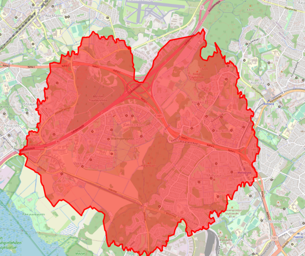
Improving access to education is one of the major challenges faced by educational planners and managers worldwide. Placement and distribution of schools across various neighborhoods and cities may vary greatly within a single metropolitan area, in rural areas as well as nationwide. To improve the methods available to local governments in analyzing school placement and accessibility, Gispo worked together with Unesco IIEP to develop a simple methodology that would allow educational planners to use a QGIS plugin to fetch, visualize, and analyse the catchment areas of schools based on OpenStreetMap road network access.
What is it about, exactly?
Polygons around a point that show the distance travelled from the point in given time interval are called isochrones, i.e. polygons of constant time. There are various different ways of constructing isochrones for points, depending on the amount of data available on the surroundings.
Ideally, we might want to have a complete 3D view of the landscape surrounding all points. That would allow us to completely model factors such as terrain, possible paths or possibilities to roam across the terrain and take shortcuts, and even factor in the evenness or hilliness of the terrain to the travel time of an individual to reach a certain point. Still, even this data would not tell us if we are wandering through a mine field, ancestry land, private property or perhaps a particularly large bloat of hippopotamus.
Also, in practice no such datasets exist for all areas of the world. While height maps and even terrain or land cover data might exist, such data does not tell us whether the terrain is actually locally traversable by foot. In most cases, even pedestrian access will take place on roads and pre-existing paths. Here, we are in luck, because OpenStreetMap forms the largest known global database of human-traversable paths. Also, using Openstreetmap data, we may consider other forms of transport, such as cycling, as we may have information on the type of path and its suitability for e.g. cycling or car access.
“The purpose of the methodology is not to find any possible way to travel to school,” says Amelie Gagnon, Development Lead at IIEP-UNESCO, “but rather to investigate the safest paths for learners to go to school, and eventually mobilise these same travel routes for other purposes (e.g. inspection circuits, delivery of textbooks, mobile libraries, school meals, etc.)”
When limiting our datasets to a network of paths, the problem also becomes more easily solved for a large number of points relatively quickly. Multiple algorithms exist for calculating the shortest path in a graph from point A to B; in this case, we want to find the shortest path to all points in the network surrounding a certain point, up to a given distance. This is called the shortest-path tree of a given point.
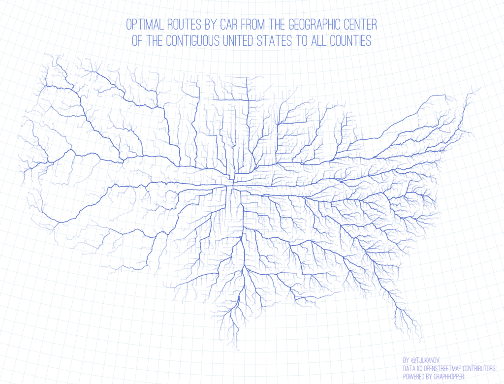
Luckily, even this needs not be implemented from scratch, as there are a variety of optimized open-source routing software components that also allow calculating shortest-path trees for points. We can pick and choose the one most suitable for the needs of educational planning, since their performance for this specific task varies greatly. A review of various open-source solutions, most of which support calculating isochrones, can be found here. Just add traveling time to the tree above, and you will have the tree up to a desired distance (e.g. 5 minutes by foot, 8 hours by car, or anything in between). Our dear colleague Topi’s website contains an animation by distance of the graph above.
With a dataset as huge as OpenStreetMap paths, and the desire to calculate travel times also over long distances (up to 60 minutes by foot or even car), the performance of the algorithm in a huge graph becomes the most important factor in our selection. Due to its performance in large networks, our pick is GraphHopper. It employs a method called contraction hierarchies, which preprocesses the graph so that important long-range nodes are saved separately from the entire network. This allows fast routing over long distances with a small amount of nodes, while retaining also the small-scale network for short-distance routing.
The plugin
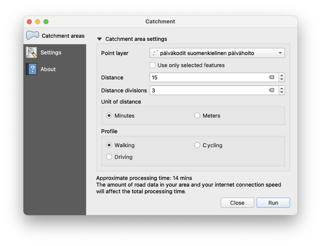
So, the proposed solution is twofold: 1) a QGIS plugin that allows the user to select the parameters for calculation, such as the points (or a whole point layer) we want to calculate the trees for, along with desired travel mode (walking, cycling, driving) and travel distance, and 2) a GraphHopper backend that contains all the OpenStreetMap data for the desired countries and which will process the QGIS plugin request.
Here, we must note a few things. Since the OSM network is indeed huge, processing the data to get a routable graph containing all walkable paths requires memory. Lots of it. Having the single GraphHopper instance process the graph(s) for the entire planet is sadly not feasible with current memory prices and availability limitations. We have to limit the instance to the country or countries we are interested in. Another limitation, obviously, is processing time. While trees for up to two hours of walking can be constructed relatively fast for a number of points, cycling or indeed driving for two hours would make the graph so huge that it becomes prohibitively slow to calculate. Therefore, we had to add a rough estimate of the processing time so the user knows if they are initiating a particularly slow query (or, indeed, a query that would take hours or days to calculate).
So what are the results?
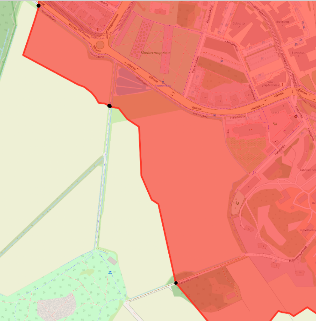
Then, on to the nitty-gritty. We haven’t discussed how we actually get the catchment area from the shortest-path tree. What GraphHopper actually calculates is just a tree, i.e. points in the road network we can reach in the given time. In the picture above, our GraphHopper result in this part of the boundary consists of three points. How does GraphHopper calculate the whole boundary out of these points?
We must keep in mind that at the moment, we have no terrain data. GraphHopper doesn’t know if there is water, woods, fields or unknown roads between the roads in the OpenStreetMap graph. If we use the road network alone, we have to guess the shape of the boundary based on it. What GraphHopper does is snap all points in the area to the closest road, whether outside or inside the catchment area, and assumes access to the area is always by the closest road. Further, this snapping distance to roads cannot currently be adjusted in GraphHopper parameters. Therefore, we are left with some guesswork.
In cases with comprehensive path networks available in Openstreetmap, like the picture above, there are so many paths that the polygon between the roads will be rather sensible. This means also that the area of the catchment polygon is close to the actual catchment area of the school.
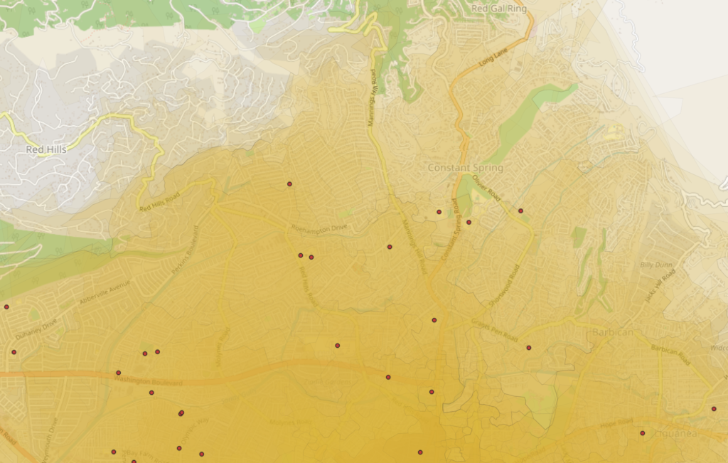
A complete road network comprehensively mapped on OSM provides optimum results, and can reflect very well the situation on the ground. One such example is Jamaica, where a very detailed road network is available on OSM, so an isochrone analysis shows the actual accessibility of students to schools when walking.
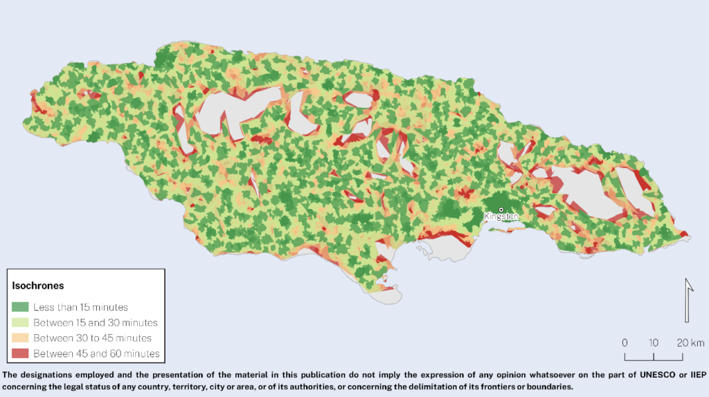
“Working together with the Jamaican Ministry of Education, Youth, and Information, we could test the plugin, examine the results and start discussing interesting insights for future policy responses,” says Amelie Gagnon. The figure above shows the isochrones mapped around primary education schools in the country. Isochrones could be drawn for all schools but two, which will be investigated further. What can be calculated, though, is that about half of the Jamaican primary school-age population can walk to school in less than 30 minutes, across the country, and 81% of the primary school-age population can get to school by walking for less than 60 minutes.
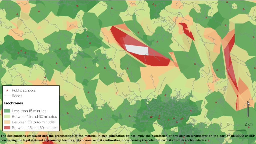
“Providing suitable conditions for learning start when students leave their home, not when arriving to school: a child walking 120 minutes to school will learn very differently than another who walks 20. For Ministries engaged in micro-planning, this tool is extremely useful to distinguish actual access from illusory access”
– Amelie A. Gagnon, Senior Programme Specialist leading the Development Cluster at IIEP-UNESCO in Paris.
Limitations
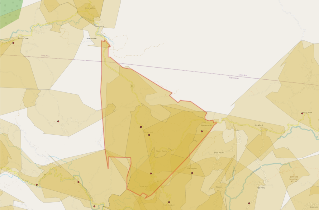
When road data is more sparse, the situation gets more difficult. In addition, missing pieces of roads in the data will result in roads that are not considered in the analysis at all, since they are not correctly connected in the network in the data. The end result will be isochrones that are deduced only from very few points of local roads, with lots of roads in the area missing or not connected, as below. Also, the shapes of the roads in the absence of crossings are simplified, so that GraphHopper only uses the end point of the 60 minute travel and does not take into account the wriggling of a single road on the way to the 60 minute point, as seen in the image below.
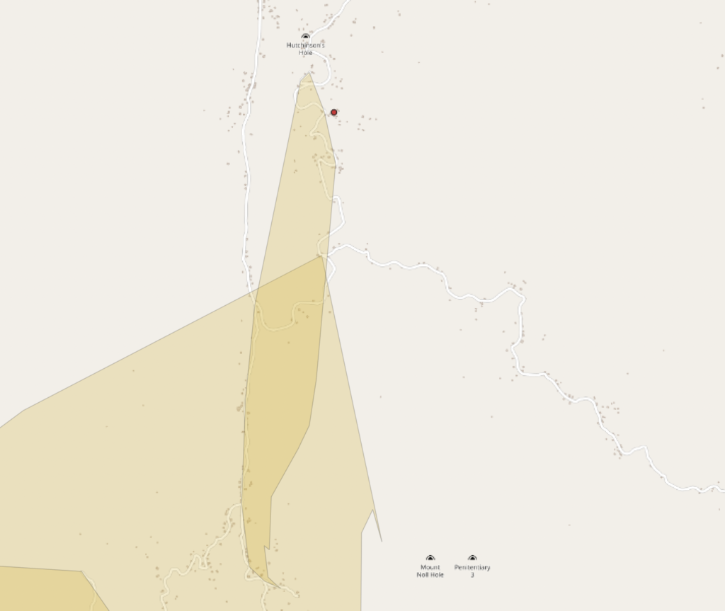
If only few roads are present, the shape of the polygon is pure guesswork. Errors in road data further decrease the size of the resulting polygon. In some cases, only very slender and simplified polygons along a single main road are produced. If areas are closer to a side road that is not connected to the main road, GraphHopper assumes such areas are not accessible from the main road. Depending on the wriggles of the road network, and on how much Graphhopper has simplified the shape of the roads, rough artefacts in polygon shapes are produced, depending on which road happens to be closest to each point in between the roads.
Such areas cannot be reliably used to estimate the number of people living within the catchment area of a school, for example, because of their arbitrary shape. Lots of people who actually have access to the school will be considered as not having access, because road data is not present in the area.
Therefore, some work is still ahead if the method is to be used for estimating accessibility in all rural settings. An obvious solution is local mapping of the roads. Another way to improve the situation would be to improve the GraphHopper code. While simplifying the road bends is crucial in doing fast calculations, the end result polygons could be constructed in a different manner. GraphHopper already has a registered issue concerning the shape of isochrones in a sparse network.
This means that instead of just taking the end points of the calculation and making simple polygons from those, Graphhopper would retain the whole network traversed up to the point and consider some buffer along the travelled roads (wriggles and all) to be included in the catchment area. Similarly, area exceedingly far from a road should not be snapped to a road. Currently, it is assumed that the travel time to the closest road is zero, while obviously travel time to the road should be taken into account.
In the most sophisticated analysis, travel time across terrain to the road would be calculated in addition to the travel along the road. However, this would result in problems in deciding which terrain is traversable. If we consider all terrain and roads to be equally traversable, we end up with perfect circles where the roads once again have no effect on the travel time.
Therefore, the calculation of catchment areas could be done in two steps. The first step would be to buffer the travelled roads with a user-configurable buffer zone. That would mean that all areas within a given distance to a road would be accessible directly from the road, even if there were a side road in the area that has no access to the main road.
This, obviously, also brings in some issues. Therefore, as a second step, such a buffer zone would be used only in the absence of other roads in the buffer zone. If a regular road network is present, the buffer would have no effect, but in a sparse network it would serve as a sensible first guess of how far a single road is accessible. In addition, travel time across terrain within the buffer zone could somehow be estimated, if we assume that traveling to a road is significantly slower than traveling on a road.
Summary
This work is yet another illustration that education does not operate in a void, and the overall quality of the data related to public infrastructure (formal roads and ways) and public behaviour (trails, lanes, etc.) is just as important as educational infrastructure.
– Amelie A. Gagnon, Senior Programme Specialist leading the Development Cluster at IIEP-UNESCO in Paris.
After the plugin development, the method was tested by educational planners in 10 countries across the globe to assess local school accessibility. While some problems were encountered due to the lack of OSM data near schools, especially in countries such as Bangladesh and Maldives which rely on water transport, the overall reception of our plugin was very positive and the early results were promising.
Therefore, our method and QGIS plugin are already in use across the globe! For a software developer, that is perhaps the best feedback there is: to know that despite missing data, a piece of software can still make a difference and improve school conditions worldwide.
You may read more on the testing and reception of the plugin in the IIEP-UNESCO blog. In the future, the method, as well as OSM data, will be improved to assess the limitations reported here, and to make it possible to reliably calculate catchment areas in a larger variety of school surroundings across the globe.
To sum it all up:
Our method of analysing school catchment areas works very well in all urban areas, because they have a dense road network and lots of users keeping the road network data in OpenStreetMap up to date. Therefore, if the majority of the population under study lives in urban or well-mapped areas, we can very well use the Catchment plugin to accurately estimate access to local education.
In rural areas, the quality of the road network data will directly determine whether the isochrones we create are close to the actual school catchment areas, and whether they will result in good or poor predictions of school accessibility. Efforts can be made with local OSM communities to connect all schools to the main road networks.
The full UNESCO-IIEP and GISPO paper will be available later in 2021, connect with development@iiep.unesco.org for more information. The QGIS plugin source code can be found on Github and the plugin itself is available in the QGIS plugins repository.
Everyone who has been sending data from one user to another and sharing it between applications knows that there is always a lot of friction involved. Some questions are always a pain to answer. Who created this? When was this updated? How is the data licensed?
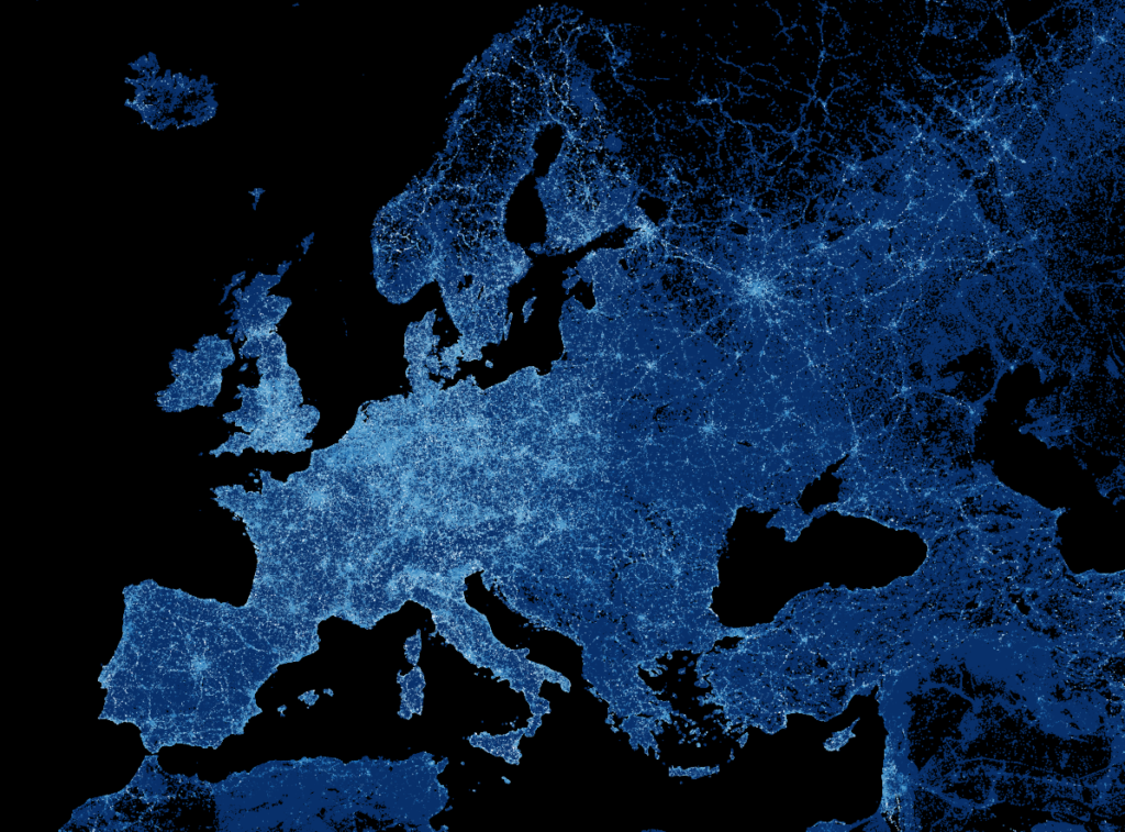
Frictionless is an open-source toolkit that aims to bring simplicity to data flows and answers these questions. Containerization has been a growing trend in software development already for several years and Frictionless Data Packages aim to bring the same approach to data.
A Data Package is a simple container format used to describe and package a collection of data. The container comes with the metadata and the actual dataset (or URL/POSIX path). A Data Package can contain any kind of data. At the same time, Data Packages can be specialized and enriched for specific types of data. The idea of Frictionless data has already been around for some time and the full Data Package spec was written in 2017 but especially in the geospatial field it is still very rare to see Data Packages.
For QGIS users it is good to note that despite the name, Data Package is not the same thing as GeoPackage. But just like GeoPackages, now it is possible to create Frictionless Data Packages with QGIS.
Spatial Data Packages with QGIS
Last year we developed the first version of Spatial Data Package plugin for QGIS. The developed QGIS plugin can also export the styles used in QGIS with the Data Package. We have been working on the development with a Swiss company cividi. They are focused on solving urban planning challenges with a data-driven approach.
With the plugin users can export their QGIS projects to the interactive platform cividi has been developing. Besides geometry and the entered metadata, the plugin also embeds the QGIS styles from the project inside the data container. This is a good example showing how the Data Package specification can be extended if necessary.
The plugin has a lot of resemblance to the Unfolded plugin we also developed last year.

You can read a description of the plugin workflow from cividi’s blog.
We are currently developing a few new features to the plugin, but it would be great to hear feedback from Frictionless data experts and Data Package users. Leave us comments for future improvements you would like to see! Open an issue or a pull request on GitHub or send us an email at info@gispo.fi.
Clouds are usually the biggest obstacle for leveraging satellite imagery in cloud-prone regions. We at Gispo are currently developing a tool for extracting good quality mosaic images from satellite data for UN operations. The pilot project is implemented together with the UN Open GIS initiative and the project aims is to test the tools in UNISFA-mission in South-Sudan.
For peacekeeping field operations it is crucial to get cloud-free satellite imagery from the areas of interest.
UN Open GIS is developing ‘Cloud-Free Satellite Imagery’, supported by Finland and project leading by Mr. Pekka Sarkola (@posiki) of GISPO (@gispofinland), to change analyze during the cloud covering period (i.e. rainy season) for UN field operations. pic.twitter.com/4ruTxd1GJE
— UN Open GIS (@UNopenGIS) October 25, 2020
The pilot project aims to build a tool that detects cloud-free images from European Space Agency’s (ESA) satellite imagery (Sentinel) and builds cloud-free mosaic images for fulfilling the requirements the missions have.
The tool targets to in various different UN operations and other worldwide organizations like FAO, WHO, Worldbank, and other NGOs.
How to detect clouds?
Our colleagues Mikael Vaaltola and Joona Laine at Gispo are currently working with the tool. When asked about the challenge the team faces, Mikael clarifies that there are two main challenges in generating cloud-free satellite image mosaics:
“The first one is seemingly obvious: how to detect and determine which areas are actually covered by clouds? There are multiple methods for cloud detection in satellite imagery, and finding the method with the ideal balance between detection accuracy and performance can be difficult.”
He continues and points out that:
“The second challenge is developing and refining a process to create new mosaics automatically as soon as new imagery is available. Ideally, the end result should contain the latest cloudless Sentinel 2 -data available and have a uniform appearance without noticeable gaps or edges.”
Image processing pipeline under construction
Creating cloud-free satellite imagery consists of two computationally expensive steps: firstly, detecting the clouds and generating cloud masks, and secondly, creating the resulting mosaic image from several gigabytes of data. This is taken into account in the image processing pipeline, which is designed for a horizontally scalable cloud-computing environment. All components are containerized and utilize open-source tools and libraries such as GDAL.
More information about the project:
Pekka Sarkola (pekka@gispo.fi / +358 40 725 2042)
UN Open GIS
Blog: Part 1/2
30 city officers from the municipality of León (México) carried through a QGIS-training to level-up their geospatial knowledge across sectors, within the different municipality departments. As any city, León needs to resolve geospatial challenges that it’s almost 1 and half million residents demand. For these municipal officers, QGIS is a powerful tool that’s capable of breaking down those geospatial issues that the officers work on.
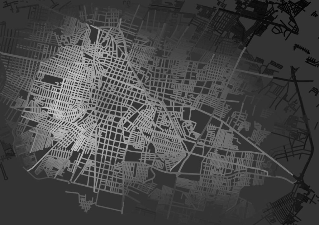
These officers are studying online on our GispoLearning E-Learning platform, to become QGIS experts and to build their understanding of the underlying basic concepts from Geography and Geographic Information Systems (GIS). They have learned to, for example, digitize city areas from aerial imagery or make some intersection spatial analysis between two geospatial datasets.
Learning together is a great tool for creating bridges between different municipal departments and the actual officers: GIS Coordinador at municipal urban planning office IMPLAN León, Wendoli Jiménez Garza, comments that the present administration has worked hard to create synergies between different departments (in regards to the GIS work-flows). She adds that the ongoing QGIS-course has strengthened the commitment to shared objectives thanks to learning together and sharing knowledge. The students represent widely the municipal government by means of the following departments:
- Urban Municipal Planning Office
- Office of Information Technologies
- Office of Urban Development
- Water supply and sewerage systems
- Cadaster
- Office of Rural Development
- Office of Public Works (Construction)
- Municipal Institute for Housing
As said, during the course, students are able to share insights by addressing questions (among the group) to the instructors in the course platform.
Students deliver also more than requested. Learning QGIS is something that the students seem to enjoy. For example, map making with the always-so-great Map Composer -tool of QGIS has proven to inspire learners to carry the learning beyond the minimum goals.


Tampere began improving the master plan data model as a KIRA-digi trial project in November 2017. The project was chosen as one of the best projects of the funding round and advances the Finnish goverment’s key project to advance the digitalization of public services.
The goal of the project is to produce a national data model. For this reason, co-operating with zoning planners from other cities is of primary importance. The master plan data model is related to the overall process of land use and the development of its enterprise resource planning. In Tampere, the goal is to develop the overall land use process by achieving consistent and fluent data exchange. The new data model also acknowledges international requirements, such as the EU INSPIRE directive.
“We see no reason why this data model couldn’t be an ‘export product’, or even why it couldn’t be used to improve the INSPIRE data model.
When possible, the data model is developed so that it can be used to present data produced in a foreign land use planning system. The results of the project will be published on GitHub and may be freely viewed and utilized over country borders. We see no reason why this data model couldn’t be an ‘export product’, or even why it couldn’t be used to improve the INSPIRE data model”, tells Jarno Kinnunen, leading Senior Planning Officer at the City of Tampere.
In Finland, similar work has also been done on other levels of zoning. Helsinki has an ongoing city plan data model project and the HAME project has developed a data model for regional plans. Meanwhile, the Finnish Ministry of Environment is focusing on national digitalization measures and solutions, making Tampere’s project rather timely. Minna Perähuhta, a specialist of the Ministry of Environment, stated the following on 14.12.2017, in the annual meeting of the Finnish Geospatial Data Network:
– We didn’t think the KIRA-digi project ensemble would include such harmonisation experiments. Helsinki’s city plan data model project surprised us first. The original idea was to collaboratively harmonise projects within the KIRA-digi ensemble. Having harmonisation efforts at such an early stage was a pleasant surprise. We then had the harmonisation of the zoning plan data model project, which was an even more structured entirety.”
With these projects, it’s a good time to look forward to an open harmonised data model and tighter collaboration with other projects.
WHAT’S BEING DONE?
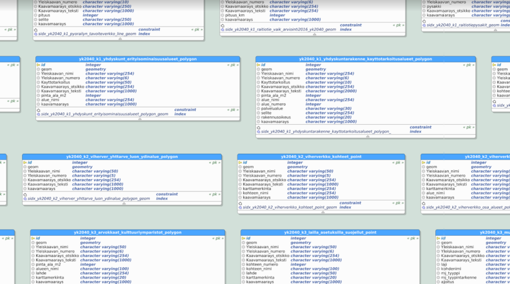
In addition to creating an open data model, the goal of the project is to develop a continuous process for master planning, create a standard for master planning data contents, and provide input for the upcoming land use law update. The data model is developed so that interested parties may adapt the data model as easily as possible. Primary needs are related to streamlining the technical implementation of the master plan and fully taking advantage of technical possibilities. Currently, a lot of overlapping work is being done, and processes which could be automated are performed manually. The secondary goal of the project is to improve the efficiency of the overall land use process.
– Additionally, it’s possible to set an example to improve the efficiency of the overall land use process by “stepping out of the box” and extracting valuable information from the data through the data model, says Jarno Kinnunen.
Through the data model and its development, land use decisions can be made available in a machine readable format. Once these decisions are in a standardised format, they can be easily shared using international geospatial data interfaces and used to develop various services that provide additional value. Other benefits include increased transparency of the general plan design process, improved efficiency of the design process, and improvements in the quality and availability of data produced by the design process. The City of Tampere describes the process:
– In the 2000s, Tampere has focused on creating approx. 20 partial general plans. Developments have been made in the presentation and content of the general plan, and the potential of geographic information system software has been realized. Massive leaps have been made, and the data required to produce the general plan is approaching a situation where the data, which is mostly produced outside our own unit, is up-to-date and of sufficient quality to be linked directly to the object in the general plan. In other words, organisational and technical developments have made the data models possible.
Meanwhile, work is underway to determine how data that is essential to the general plan can be linked to e.g. the city plan, and how this information can be managed. The idea is to use each object from the master plan, such as a residential or recreational zone, as a platform, that can be appended with related information such as clarifications, plan provisions, spatial- and metadata.
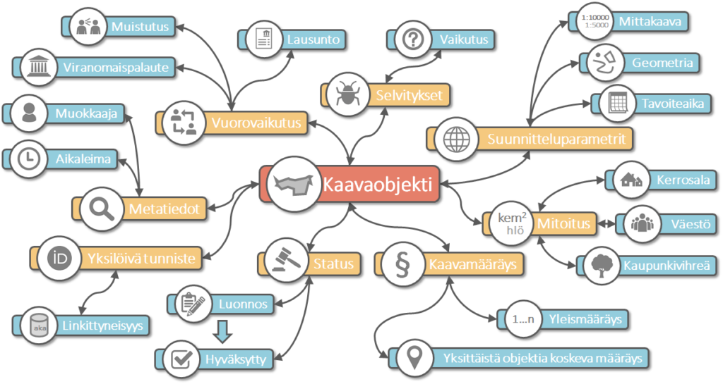
Moving forward openly
The project’s key word is openness, as other cities struggling with the same issues can hopefully benefit from the project. Tampere wants to discuss the development of the master plan data model with the planners of reference cities.
“Our initial contacts have seemed promising, and it can be sensed that the same line of thought followed elsewhere”, tells Kinnunen.
The first version of the general plan data model is developed in 2018 openly and following agile development principles. The results of the project are publicly available during and after development and may be freely developed further. The development is done collaboratively by Gispo and geospatial experts of the City of Tampere, and the views and opinions of professionals from other organisations are also taken into account:
– We have previously worked on a city plan data model with the city of Helsinki, so in a sense we know what to expect. Still, the general plan will surely provide its own challenges, that are now being iteratively explored. It’s important to communicate regularly with the client during the data model development and discuss the state and future direction of the project. We want to distribute the data model openly as early in development as possible, so our work is transparent to everyone”, says Pekka Sarkola, CEO of Gispo Ltd.
One of the project’s goals is also to renew the general plan design’s delivery model and to offer ideas for the upcoming land use and building law reform. The project progressess iteratively, with development followed by testing, feedback, and further development.
– During the data model development, welcome changes to the current land use law are identified and documented. Legislative issues with digitalization, such as missing or inadequate land use legislation, are then evaluated in the project’s final phase. The recognized issues will be reported to the Finnish Ministry of Environment at the end of the project, Tampere promises.
Thanks for comments: Head of Master Planning Pia Hastio, City Geodesist Anna Mustajoki, and Leading Senior Planning Officer Jarno Kinnunen, City of Tampere.
More information on the project in Finnish:
- KIRA-digi project presentation: Yleiskaava kehittyväksi tietomalliksi
- 3DYKS – digitalization of city planning, case: Tampere
Related projects:
In 2015, Gispo produced an analysis of potential flying squirrel glide paths for the City of Espoo. The analysis was based on laser scanned data and the results were visualised as maps, which may be used to support city planning and to target fieldwork to specific areas.
Supporting decision making
In a built environment, flying squirrels struggle to find a route from tree to tree. In particular, wide highways without suitable rest areas obstruct the animals’ routes. Digital elevation and vegetation models built using laser scanned data and a specific calculation model were used to identify potential obstructions and crossing points. A model was developed to determine the effect of the forests’ height on the probability of a successful glide from one tree to another. The goal of the project was to support the ability of Espoo’s public administration representatives to recognize the crossing points used by flying squirrels by utilizing digital vegetation and elevation models. The project was awarded second place in the City of Espoo’s innovation competition.
Open data
Data processing, refinement, analysis and visualisation were done using a PostgreSQL database with the PostGIS extension, GDAL/OGR library and the QGIS geographic information system. The City of Espoo published the project’s geospatial data analysis results as open data on the National Treasury’s avoindata.fi web service.
Our role in the project:
- Developing a calculation model
- Implementing the geospatial data analysis
- Processing the data
- Visualising the results of the analysis
Read more (in Finnish): News article on Yle, the Finnish Broadcasting Company
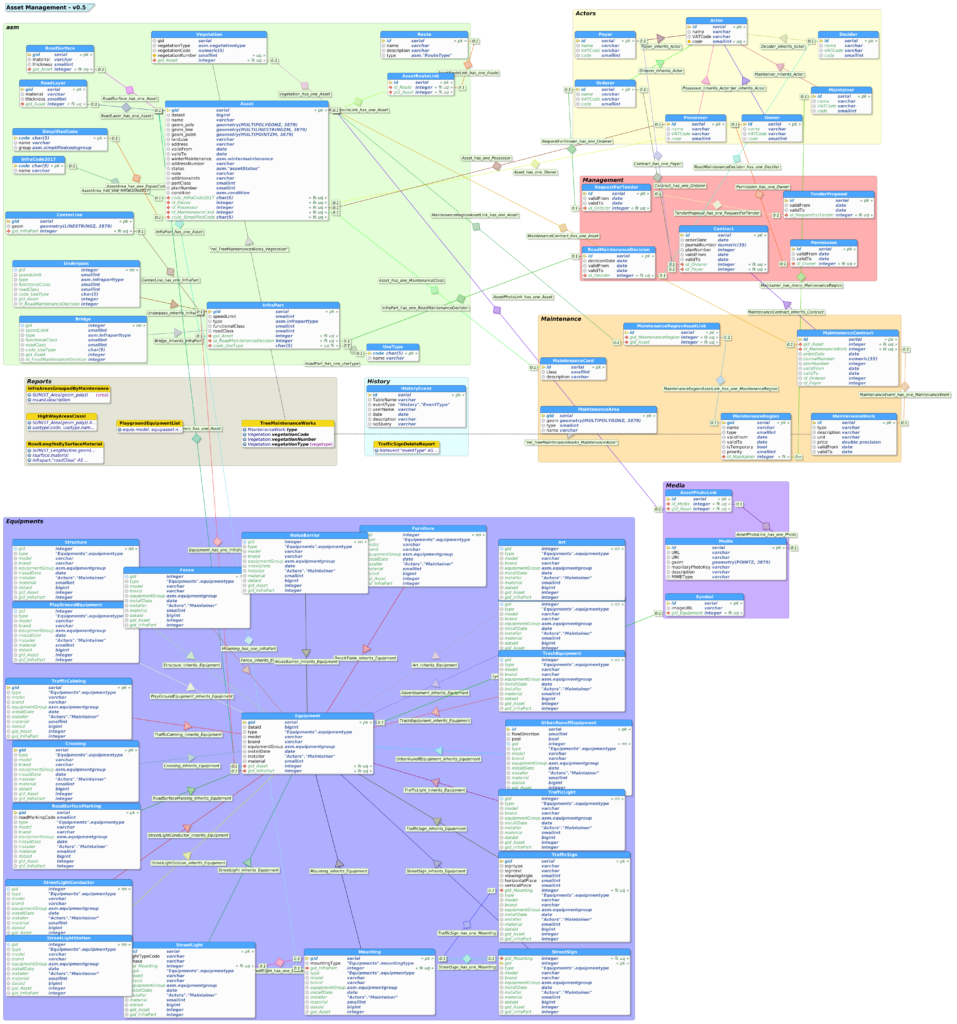
Cities have roads, parks, playgrounds and other infrastructure assets that are maintained, renewed and built on demand. Cities use a geographic information system for various tasks, including analysing the needs of the residents, creating reports and organising maintenance. Data models are an essential part of this system. The City of Espoo’s KIRA-digi funded project “Developing an open source asset management system and its interfaces”, led by Saara-Maija Pakarinen, has examined infrastructure asset data modeling from many viewpoints. The data model has been developed in collaboration with Gispo and designed with pgModeler, a PostgreSQL database modeling software.
Even though public infrastructure asset management affects every citizen, not a single open geographic information system has been designed specifically for this purpose, making Espoo’s project even more meaningful. The data model is published on a GitHub-repository, which also contains the project’s wiki. This makes it easy for anyone to try the data model and contribute to future development.
The City of Turku offered an opportunity to conceptualise and implement applications that benefit the people and organizations of the Turku campus and science park. 16 teams and tens of people accepted the challenge and participated in the competition with a main prize of 8000€. Gispo Ltd. was brought in by Turku Science Park Ltd. to assist and spar the teams. The hackathon was held over the weekend 29.9.-1.10.2017. The longer term goal of the project is to develop the Turku science park area into a vibrant district.
OPEN DATA, 3D CITY MODELING AND AN IOT-PLATFORM
The teams had access to various open datasets, including public transit and event data. The City of Turku also provided access to geospatial data APIs and the 3D model of Turku. Teams were also offered access to the Sova3D web platform and the Elisa IoT platform. As the data used is open, the used datasets are still freely available for viewing and use. A Mapillary capture session, led by Janne Mustonen from the City of Turku, was organized during the hackathon weekend. Gispo has added captured images of the area to Mapillary.
Winning teams
The judges eventually ended up with two winners: Go Questing and TwinCities. The members of the second winning team didn’t know each other before the hackathon, making their achievement even greater. Both teams won 4000€ and got the chance to pitch their ideas at the opening of the Turku Visitor and Innovation Centre in December 2017.
Gispo’s role
The hackathon was hosted and scheduled by Sanna Jokela from Gispo Ltd, while Erno Mäkinen helped the teams utilize open data and the technical platforms. Experts from Elisa, the City of Turku, Regional Council of Southwest Finland and Turku Science Park also guided the teams.
“The Turku Future Hackathon was a successful trial of a new operating model, in which practical work is done directly with partners. The facilitation and success of such events is of primary priority, and Gispo Ltd. has succeeded marvelously.”, says specialist Janne Mustonen from the City of Turku.
“In hackathons, the organizer has a major responsibility in ensuring the event progresses smoothly and there’s a good athmosphere. Sanna handled the event all through the weekend and gave positive energy to competitors and organizers alike. Well done!” -Kalle Luhtinen, Turku Science Park Ltd.
Check out the slideshows and pitches of each team.


In 2018 the city of Helsinki received KIRA-digi funding for the advancement of digitalization in zoning. The “Asemakaavat yhteisenä tietovarantona” (City plans as a common resource) project aims to improve data management in city planning through the use of open interfaces. Helsinki has put an emphasis on the development of city planning data management since 2015. Gispo has supported the city of Helsinki in the adoption of open technologies and wishes to continue their involvement in Helsinki’s projects.
