Turning open data into colourful maps
All that buzz about open data! The public sector organisations are obliged to publish a lot of their data, so sure there is a lot of it out there – but what and where? I have found that too often data is hard to find, and when you find something, it is in a complicated format, scattered in numerous places or it is of poor quality in one or the other way.
None of that really hurts if you don’t need the data. But if you have a point to make, good data offers you great possibilities to do it in a powerful way.
When it comes to public financing, people are often interested in how much it benefits their own life in one way or another: how much is invested in my neighbourhood or region, or in the service sectors that concern me? These are good examples of information that sits well on maps. Maps are an unbeatable tool to illustrate regional division of phenomena or – why not also – money flows.
In this article I want to share a case example of how public open data is turned into a set of maps for different use cases using free tools.
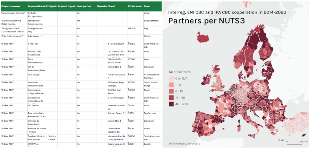
A map can breathe life into tabular data when regional information is at play.
EU financing put on maps
The European Union aims at making sure that no region is left behind in Europe (if you want to read more, google EU Cohesion Policy). Different financial instruments are used to support European regions in a variety of ways. One of the instruments is called Interreg which aims at building cooperation between European regions to tackle common challenges together.
Like for any EU financing, oh yes, data for Interreg is there. For any EU support mechanism it is possible to find out who received financing, for what, where, when and how much. Some of it is in different web services presented in statistical graphs, info sheets and what not. Sometimes also maps are used. But quite often the selected formats or the described data sets are not exactly what I am looking for. And fair enough, it is nearly impossible to provide online tools that would allow the user to tailor every possible chart or map of their dreams easily and in the exact format they happen to like or need. However, the big bulk of the data is usually available in raw format which can be downloaded and freely used.
To make use of such data, you need to know what you want to tell with it and how you want to lay it out (a graph, a map or something else). In case you want to make a map you will need some mapping skills and a tool to do it. And now we are getting to the core of the business – how to make a map out of some publicly available data!
Table rows become intriguing maps
In this exercise I downloaded all Interreg project data from the 2014-2020 financing period that is available in the public keep.eu database. My idea was to make three different map visualisations from this data: I wanted to show the activity level of the regions by showing the number of projects and partners in each region, as well as how much of this specific type of EU financing* has been paid to the partners in each region. The idea seemed clear but the data was not ready to be used in its original shape, which is quite often the case.
The data can be downloaded from keep.eu in Excel format. The xlsx file has a tab for all projects and another tab for all partners that took part in the projects. No data was readily listed per region, and therefore some data aggregation needed to be done.
I wanted to upload a clean csv file into QGIS (the free software where the maps were to be made). For this end, I did the data handling with some Python code and the very handy Pandas library. Other option would have been to handle the data in Excel, and actually also QGIS would offer tools for it. But I wanted to have a script that I could easily reuse with updated source data if needed. The script now reads the xlsx, does its tricks and, in the blink of an eye, returns the needed csv – very handy!

Some of the Python code that sorts the data from .xslx and writes it into a csv file.
Now I had created the data per region but I still needed the region borders to create a regional map. Luckily, Eurostat offers the European statistical regions as a Shapefile, which is just what I needed.
Once the csv is ready and the regions are available, the work was almost done. In QGIS I simply started a new project and imported both the shapefile and the csv into it and linked the two datasets using the “NUTS ID” information available in both (connecting data sets always requires this “key” which can sometimes be tricky to create/find). After that I simply made three layers, one for each of my planned maps, and visualised the wanted data so that each region gets a colour shade based on the value it holds (these maps are known as choropleth maps). Selecting colours for a map was possibly one of the trickiest things in the whole process, so the importance nor the difficulty of this phase is not to be under-estimated.
Finally, I added a simple basemap on its own layer on the “bottom” of my map using the QGIS QMS plugin to make the continents visible.
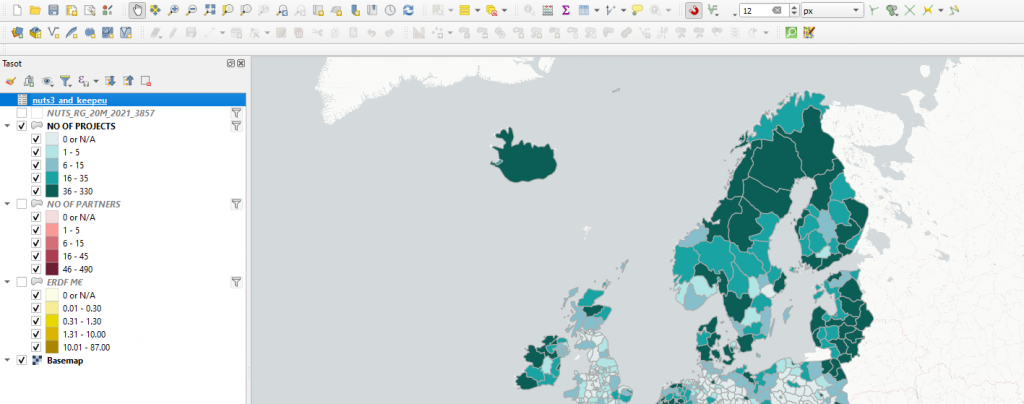
The layers in the QGIS project look like this.
How to publish?
Once the maps are ready in QGIS, the final question is how to make them available for users. Still maps are useful when there is a wish or need to present information in a very specific way or format. However, people tend to appreciate, and nowadays even expect, a possibility to find exactly the information they are interested in instead of generic overviews.
This time I first made some still map images that could be used in social media as examples. For this I used the layout tool in QGIS. With the layout tool one can fairly easily create map layouts with title, legend, scale bar and other graphic elements. My still maps offer overviews of phenomena but if the user wants to get the more exact figures for his or her own region, it is not possible. Designing a still map can be considered an especially challenging task because the map creator makes all decisions and the map user can’t make any.

Examples of still maps created in QGIS layout. Country-specific maps can be created by filtering data on the layers.
In order to make the big amount of data behind the maps more available for the user, I decided to add some interaction on my maps by creating an online version with the qgis2web plugin of QGIS. When the interactive map opens in the browser, the user can select one of the three maps they want to view. On these maps the user can zoom into the map for more precise view and see all data (no of projects, no of partners and no of euros) for a given region at once in a popup that appears on the region when the user moves a mouse on it. On the interactive version of the maps the user can get both, generic overviews as well as the more exact figures for any single NUTS region.
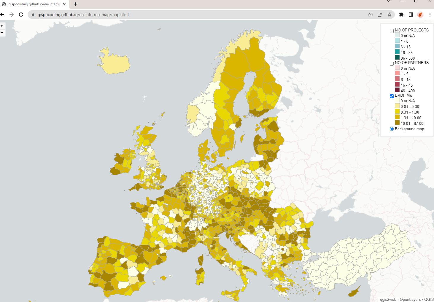
The interactive webmap created by the qgis2web on OpenLayers opens up fullscreen in the browser. If you want to try it out yourself, follow the link a bit further down.
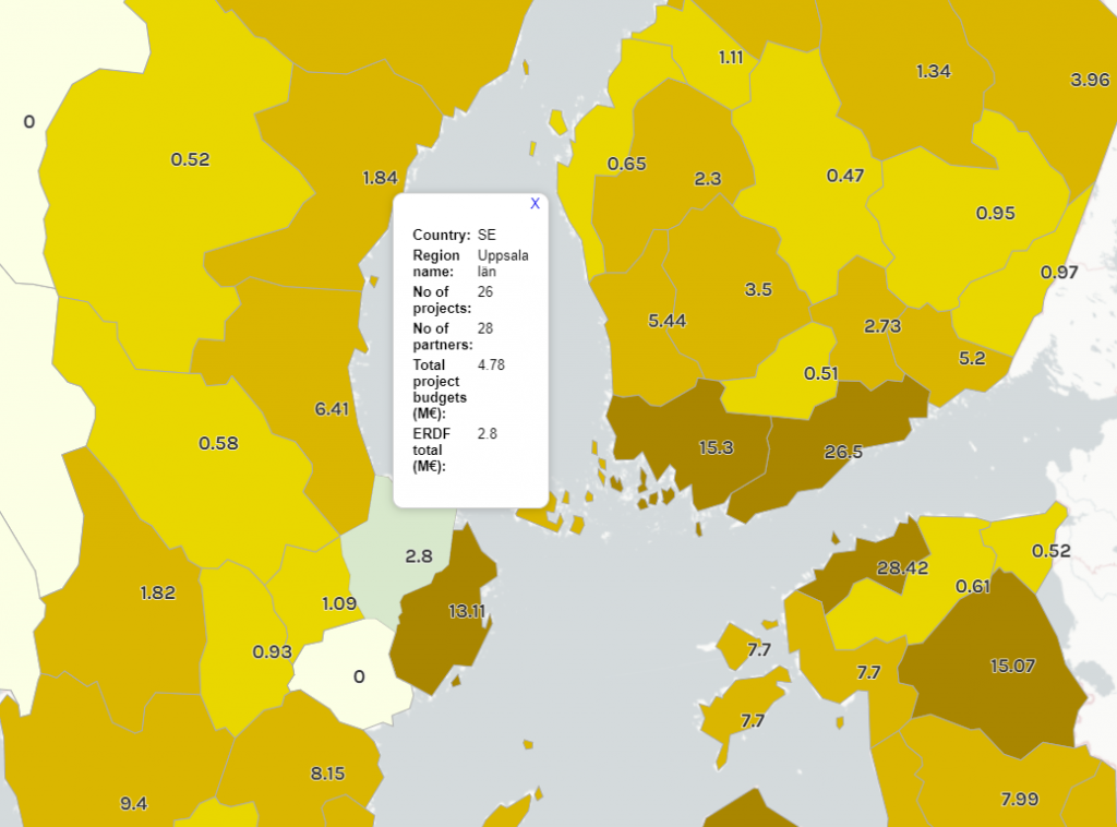
By zooming in to the web map the user can see more information for each region (here the ERDF budget).
By hovering the mouse over a region, all data for that region becomes visible in a popup window.
You can find the webmap and try it out yourself . For more information about it, see the GitHub page where the project is published.
What to take home from all this
Making maps is great fun. But it is also a challenging task that requires good data and a lot of different choices and decisions to be made (e.g. content, geographic extent, type of map, used colours and format of publishing, to name but a few). Most important is to know what is the expected use of your map, i.e. what you want to communicate with it. A good plan and quality data that supports the plan will already take you far. QGIS is a free and open tool, and if you need help with building your map maker skills, don’t hesitate a second to be in touch with Gispo (you can also check our training catalogue). We’ll be happy to share more of our knowledge on the topic!
This article is written by Linda Talve.
